
For accurate printing, aim to set your monitor brightness between 120 to 150 nits. This range helps guarantee color consistency and prevents glare or eye strain, especially in well-controlled lighting environments. Adjust your brightness gradually while comparing test images to find what works best in your workspace. Proper calibration and ambient lighting are key. Keep exploring to discover more tips on maintaining perfect brightness and achieving flawless print colors.
Key Takeaways
- Aim for a monitor brightness between 120 to 150 nits for consistent and accurate printing results.
- Adjust brightness based on ambient lighting: lower in bright environments, higher in dim settings.
- Regularly calibrate your monitor to maintain optimal brightness and prevent drift over time.
- Use test images to fine-tune brightness settings, ensuring smooth tonal transitions and accurate colors.
- Maintain controlled workspace lighting to minimize glare and reflections that can distort perceived brightness.

Calibrite Display Pro HL Monitor Calibration Colorimeter for LCD Mini LED and OLED Displays, Measure up to 3000 Nits, PROFILER Software, USB C with Adapter, Validation/Color Uniformity Tools
SPECIFICATIONS: HL high luminance sensor colorimeter measures up to 3000 nits, calibrates and profiles LCD mini LED OLED…
As an affiliate, we earn on qualifying purchases.
As an affiliate, we earn on qualifying purchases.
How Does Monitor Brightness Affect Printing Color Accuracy?
Monitor brightness plays a crucial role in ensuring accurate printing colors because it directly influences how you perceive on-screen hues. When your monitor is too bright or too dim, it skews your view of color accuracy, leading to mismatches when printing. Excessive monitor glare can wash out colors, making them appear less vibrant and harder to judge correctly. Screen flickering, often caused by improper brightness settings, can cause eye strain and fatigue, reducing your ability to distinguish subtle color differences. Adjusting your monitor brightness to a comfortable level minimizes glare and flickering, helping you see true colors more clearly. This control allows you to make more precise color decisions, ultimately improving the accuracy of your prints. Proper brightness management is key to consistent, reliable color matching. Additionally, understanding how lighting affects ambiance can further enhance your workspace for better visual clarity. A well-structured approach to digital content can also provide insights into optimizing your monitor settings for color accuracy. Ensuring that your workspace is well-lit, along with proper gear care tips, can significantly improve your focus on color-sensitive tasks. Maintaining proper indoor air quality can also contribute to a more comfortable environment, reducing distractions and improving focus while working on color-sensitive tasks. Using specific tracking gear can also help you monitor your workspace’s light conditions effectively, ensuring optimal viewing for color accuracy.
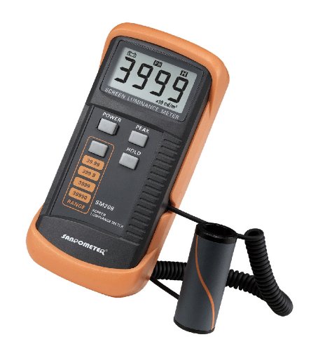
SM208 Screen Brightness Meter Screen Luminance Meter
Adopting a detector powered by a silicone photocell with high stability, photostability, and shock resistance, strict vision correction…
As an affiliate, we earn on qualifying purchases.
As an affiliate, we earn on qualifying purchases.
What’s the Ideal Monitor Brightness for Printing?
Finding the ideal brightness level for your monitor is essential to achieve accurate print colors. For consistent results, you should set your display calibration to match the ambient lighting of your workspace. Generally, a brightness between 120 to 150 nits works well for most printing tasks. Too high a setting can cause glare and strain your eyes, while too low can make details hard to see. Monitor ergonomics play a role in maintaining comfortable viewing conditions, so position your screen to avoid reflections and adjust brightness accordingly. Regularly calibrate your display to guarantee your monitor maintains the correct brightness for accurate color reproduction. Additionally, optimizing your whole-home water systems can help you focus better by ensuring a comfortable environment. Remember, a well-calibrated, ergonomically optimized monitor helps you judge your prints more precisely. Furthermore, maintaining good lighting conditions in your workspace can significantly reduce eye strain and enhance your overall comfort. Additionally, ensuring your workspace has good air quality benefits can enhance your focus and comfort while working on print projects. Also, consider how color accuracy affects the visual quality of your prints, as it plays a key role in achieving the desired results. Implementing effective email marketing strategies can also help you stay informed about the latest tips and tools for ensuring your print projects meet high standards.
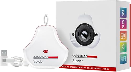
datacolor Spyder – Monitor Calibrator for Graphic Designers, Photographers, and Content Creators, Shows You True Colors, Works on OLED Monitors & LED Screens, Easy-to-Use Color Calibration Tool
Color “Surprises” Are a Thing of the Past: Datacolor’s exclusive DevicePreview TM Beta feature simulates what your photos…
As an affiliate, we earn on qualifying purchases.
As an affiliate, we earn on qualifying purchases.
How to Calibrate Your Monitor for Accurate Print Colors
Once you’ve adjusted your monitor’s brightness to match your workspace lighting, the next step is to calibrate its color settings to guarantee accurate print results. Start by confirming your monitor’s ergonomics support proper viewing angles, reducing eye strain and maintaining consistent color perception. Use calibration tools or software to set your monitor’s color profile, focusing on gamma, white point, and color temperature. Pay attention to screen resolution, as higher resolutions deliver sharper images, making color adjustments more precise. Regular calibration ensures your monitor displays colors accurately, aligning on-screen visuals with printed output. This process minimizes surprises in your print results and boosts your confidence in color-critical projects. Proper calibration, combined with good ergonomics, keeps your workflow efficient and your colors true.
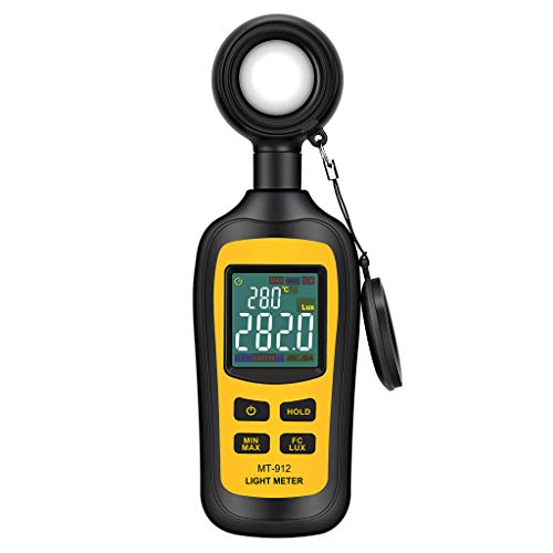
Light Meter Digital Illuminance Meter Handheld Ambient Temperature Measurer, Range up to 200,000 Lux, Luxmeter with 4 Digit Color LCD Screen
Measures luminosity from 0 to 200,000 Lux and ambient temperature
As an affiliate, we earn on qualifying purchases.
As an affiliate, we earn on qualifying purchases.
Why Ambient Light Matters When Setting Your Monitor Brightness
Sure! Here’s your revised content with the requested adjustments:
—
Ambient light has a significant impact on how you perceive your monitor’s brightness. Too much ambient lighting can cause screen glare, making details harder to see and forcing you to increase brightness unnecessarily. Conversely, dim lighting might make your screen appear overly bright, leading to eye strain. Adjusting your monitor to match your environment guarantees better color accuracy and reduces fatigue. For instance, creating a cozy atmosphere with movie-night planning tips can enhance your overall viewing experience. Additionally, optimal lighting conditions can improve your productivity levels while working. Moreover, understanding how lighting conditions influence visual perception is crucial for effective monitor calibration. Using the right tools, such as styling cream, can help you achieve the desired aesthetic in your workspace. Use the table below to understand how different lighting conditions affect your setup:
| Lighting Condition | Effect on Perception | Adjustment Tip |
|---|---|---|
| Bright room | Increased glare | Lower brightness |
| Dim room | Screen appears dull | Increase brightness |
| Direct sunlight | Severe glare | Use anti-glare screens |
| Soft ambient light | Balanced view | Maintain current settings |
Controlling ambient lighting helps you achieve ideal monitor brightness for printing. Additionally, understanding the impact of indoor air quality on your overall health can enhance your workspace environment.
—
Let me know if you need further adjustments!
How to Test and Adjust Your Monitor Brightness for Printing
To guarantee your monitor shows accurate colors for printing, you need to properly calibrate your display first. Use standard test images to assess and fine-tune your brightness gradually until the screen matches printed output. Making small adjustments helps you find the perfect balance for consistent, reliable results.
Calibrate Your Display Properly
Calibrating your display is essential to guarantee that your monitor’s brightness accurately reflects the printed output. Begin by adjusting your screen’s color temperature to match the printing environment, ideally around 6500K for neutral tones. This ensures colors look consistent across screens and prints. Next, address screen glare by positioning your monitor to minimize reflections that can skew brightness perception. Use a calibration tool or built-in software to fine-tune brightness and contrast settings, ensuring your display isn’t too bright or dark. Proper calibration helps you see true colors and brightness levels, making it easier to judge how your print will turn out. Regular calibration is key to maintaining accurate color and brightness, preventing surprises in your final printed results.
Use Standard Test Images
Using standard test images is an effective way to evaluate and adjust your monitor’s brightness for printing. These images reveal how your display reproduces colors and shades, helping you match them to printed output. Confirm your color profiles are accurate, and your monitor calibration is up-to-date. When viewing test images, pay attention to subtle gradients and details; if they’re not clear, adjust your brightness accordingly. Additionally, understanding battery inverter generator capacity can help you optimize your setup for various printing needs. Incorporating mind-body healing techniques can also enhance your focus during this critical adjustment process. The table below illustrates common test images and their impact:
| Image Type | Purpose | Emotional Effect |
|---|---|---|
| Gray Gradient | Detects banding and contrast | Confidence in smooth transitions |
| Color Checker Chart | Checks color accuracy | Satisfaction in true colors |
| Black & White Image | Evaluates contrast & detail | Assurance in tonal range |
| Fine Line Pattern | Tests resolution & sharpness | Trust in image sharpness |
| Brightness Chart | Adjusts brightness levels | Peace of mind in print matching |
Adjust Brightness Gradually
Once you’ve identified the test images that best reveal your monitor’s current brightness, it’s time to make adjustments. Do this gradually to avoid sudden changes that can cause screen flickering or eye strain. Lower or raise your brightness in small increments, pausing to compare the images each time. Pay attention to blue light levels—excessive blue light can distort color perception and cause discomfort, especially during long sessions. Adjust until the whites look neutral, not overly bright or dull. Avoid sudden jumps in brightness, which can lead to flickering or eye fatigue. Take your time, making small tweaks, and regularly step back to evaluate how the adjustments impact your ability to match printed colors accurately. This careful, incremental approach helps you find the ideal brightness for printing.
Common Mistakes That Hurt Your Print Quality

Ignoring color calibration can lead to prints that don’t match your screen, wasting time and ink. Overlooking the paper type you choose can also cause unexpected color shifts and quality issues. To get the best results, make sure you’re calibrating your monitor and selecting the right paper for your project. Additionally, consider how fragrance profiles can influence your overall project presentation, as scents can impact the perception of color and quality in printed materials. Furthermore, understanding ethical consumerism can guide you in choosing sustainable materials that enhance both the visual appeal and the integrity of your printed work. Regularly cleaning your printer can also prevent hard water stains and ensure that your prints maintain their intended quality. Incorporating natural ingredients into your printing process can further support sustainable practices and enhance the overall quality of your printed materials. Moreover, employing a self-directed IRA can provide you with additional financial resources to invest in high-quality printing technologies.
Ignoring Color Calibration
Color calibration is an essential step that many overlook, but neglecting it can greatly impact your print quality. When you skip calibration, you risk color inconsistency and calibration errors that distort your final output. Here’s what you might encounter:
- Colors appearing dull or washed out on print compared to on-screen images
- Unexpected shifts in hue that make your work look off
- Inconsistent colors across different projects or even within the same document
- Frustration from wasting time and materials trying to get accurate results
Furthermore, understanding color consistency is crucial for achieving the best print outcomes. For example, using high-quality monitors can significantly improve your ability to see color nuances accurately.
Overlooking Paper Type
Many printers and users overlook the importance of selecting the right paper type, but doing so can considerably harm your print quality. The paper texture affects how your ink interacts with the surface—smooth paper yields sharp images, while textured paper adds depth but may cause uneven ink absorption. Ignoring this can lead to colors appearing dull or bleeding, ruining your final print. Ink absorption varies based on the paper’s coating and material, influencing how vibrant and sharp your images look. Choosing the wrong paper type may cause ink to spread or dry unevenly, reducing detail and contrast. Always match your paper to your project’s needs, considering texture and absorption, to guarantee your monitor’s brightness setting translates accurately into high-quality prints. Additionally, understanding store return policies can help you select the right paper if you need to exchange it for better results.
Tips to Maintain Consistent Monitor Brightness Over Time
Over time, monitor brightness can fluctuate due to factors like aging hardware or environmental changes, which can affect your color accuracy. To keep things consistent, consider these tips:
- Regularly calibrate your monitor to maintain ideal color temperature and brightness levels.
- Adjust your workspace lighting to reduce screen glare, preventing the need to increase brightness unnecessarily.
- Avoid direct sunlight or harsh lighting that can cause reflections and distort your perception of colors.
- Keep your monitor clean and dust-free, as dirt can influence perceived brightness and color accuracy.
Tools and Software to Help Set the Right Monitor Brightness
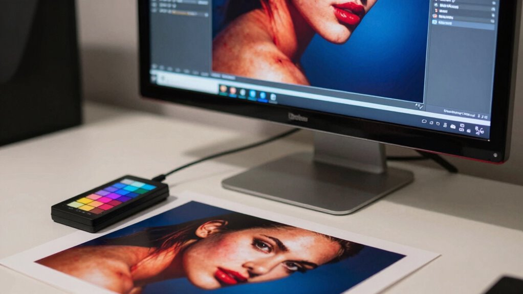
Using the right tools and software can make it much easier to set and maintain your monitor’s ideal brightness. Hardware upgrades, like calibration devices, guarantee accurate readings and consistent color output. These tools help you fine-tune your display’s brightness to match printing conditions, reducing guesswork. Additionally, software solutions offer customizable color profiles, which optimize how colors appear on your screen. By creating or adjusting these profiles, you align your monitor’s output with printed results more precisely. Many calibration tools come with built-in software that guides you through setting the correct brightness and color balance. Regularly updating your hardware and calibrating your display ensures your monitor stays in sync with your printing environment, giving you confidence that what you see on-screen will match your printed output.
Frequently Asked Questions
Can Monitor Brightness Differences Impact Print Job Deadlines?
Yes, monitor brightness differences can impact print job deadlines. If your monitor’s brightness isn’t aligned with ambient lighting, it can cause color inconsistencies, making it harder to accurately judge color accuracy. This may lead to multiple revisions, delaying your deadline. To avoid this, guarantee consistent monitor brightness and ideal ambient lighting, so you maintain color consistency throughout your workflow and meet your printing deadlines efficiently.
How Often Should I Recalibrate My Monitor for Printing?
You should recalibrate your monitor every four to six weeks to maintain color consistency. Imagine your screen as a painter’s palette—over time, colors can drift, losing their vibrancy. Using calibration tools, you realign your display’s brightness, contrast, and color accuracy, ensuring your prints match what you see on screen. Regular recalibration keeps your work true to life, preventing surprises when your project finally hits the printer.
Do All Printers Require the Same Monitor Brightness Settings?
Not all printers require the same monitor brightness settings because color calibration depends on your specific printer and ambient lighting conditions. You should adjust your monitor brightness based on your workspace’s ambient lighting to guarantee accurate color viewing. Bright environments often need higher brightness levels, while darker rooms require lower settings. Regularly calibrating your monitor helps maintain consistent color accuracy, regardless of your printer type or lighting environment.
What Role Does Monitor Contrast Play in Print Color Accuracy?
Monitor contrast plays a essential role in print color accuracy because it affects how your display shows differences in shades and tones. Proper contrast enhances color calibration and display gamma, ensuring colors appear consistent between your screen and printed output. When contrast is optimized, you get better control over color nuances, allowing you to make precise adjustments for accurate printing results. Keep contrast balanced for reliable, true-to-life color representation.
Is There a Universal Monitor Brightness Setting for All Printing Projects?
Think of your monitor as a lighthouse guiding your print color accuracy—there’s no one-size-fits-all brightness. You need to adjust based on ambient lighting and your specific project to guarantee color consistency. Bright enough to see details without washing out colors, but not so bright it skews your perception. Regular calibration helps maintain this balance, making your prints match your on-screen expectations, regardless of the project.
Conclusion
Remember, “a chain is only as strong as its weakest link.” Keeping your monitor’s brightness properly calibrated is essential for accurate print colors. Regularly check and adjust your settings, considering ambient light and using the right tools. When your monitor is in sync with your prints, you’ll save time, ink, and frustration. Stay attentive to these details, and your prints will consistently look their best—because precision today leads to perfection tomorrow.