
When choosing matting techniques, consider both color and material to best complement your artwork. Opt for acid-free mats to protect over time and select colors that either contrast or harmonize with the piece for visual interest. Textured or colored mats add depth, while the border thickness influences focus—thicker borders draw inward, thinner borders create seamless progressions. Thoughtful combination of these elements enhances longevity and presentation; continue exploring to discover how these choices can elevate your display.
Key Takeaways
- Choose acid-free and museum-quality mats to prevent artwork deterioration over time.
- Select colors that complement or contrast with the artwork to enhance visual interest.
- Consider textured or colored mats to add depth and dimension to the presentation.
- Use appropriate border thickness to direct focus and influence the viewer’s perception.
- Match material finishes with the overall frame style for a cohesive and polished display.

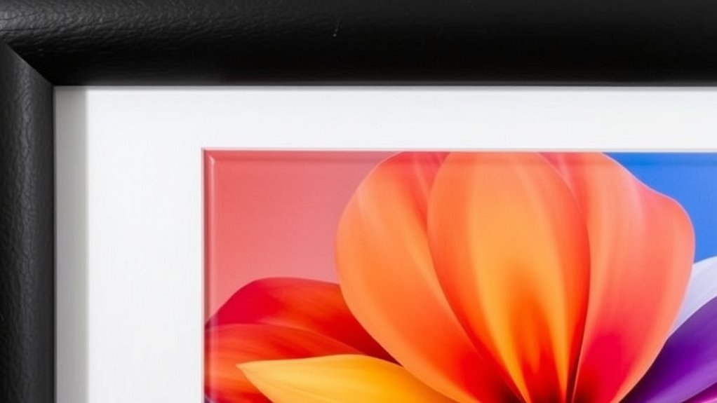
Are you looking to seamlessly blend foreground subjects with their backgrounds? When it comes to matting techniques, your choice of frame styles and mounting options plays a pivotal role in achieving that harmony. The right frame style can complement your artwork or photograph while subtly guiding the viewer’s eye toward the main subject. For instance, a sleek, modern frame might suit contemporary pieces, whereas ornate, decorative frames work well with traditional artwork. Your selection should consider both the aesthetic and the material of the frame, guaranteeing it enhances rather than distracts from the piece.
Choosing the right frame style enhances artwork and subtly guides viewer focus.
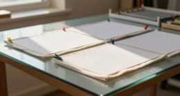
Mounting options are equally important because they influence how your artwork is presented and preserved. Whether you opt for window mounting, back mounting, or dry mounting, each method offers distinct advantages. Window mounting, with a visible border around the artwork, creates a sense of depth and focus. Back mounting, which involves attaching the piece directly to a backing board, provides a clean, minimal look that emphasizes the artwork itself. Dry mounting, often used for photographs or prints, involves adhering the piece directly to a substrate, creating a flat, stable surface. Your choice of mounting depends on the medium, intended display environment, and the preservation needs of the piece.
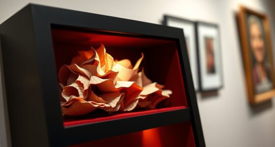
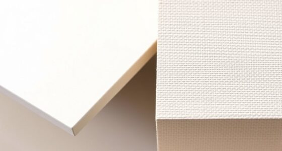
Material considerations also come into play when selecting matting techniques. The mat board itself can vary from standard white or cream to more specialized options like acid-free, museum-quality materials. Acid-free mats prevent deterioration over time, especially important for valuable or fragile items. You might also consider textured or colored mats to add visual interest or to help frame the artwork more effectively. The thickness of the mat border influences how the piece is perceived—thicker borders draw attention inward, while thinner borders create a more seamless transition between art and frame. Additionally, considering lightfastness in your mat materials can ensure the colors remain vibrant over time.
When choosing your matting approach, think about how these elements work together. A well-chosen frame style combined with the appropriate mounting options and materials will highlight your artwork, protect it from damage, and create a visually balanced presentation. Remember that the goal of matting isn’t just aesthetic; it’s also about safeguarding your piece. The right combination guarantees longevity and preserves the integrity of your artwork while making the display more compelling. So, take your time selecting each element thoughtfully. Your attention to detail will pay off with a polished, professional-looking presentation that truly enhances the visual impact of your work.
Top picks for "matt techniqu color"
Open Amazon search results for this keyword.
As an affiliate, we earn on qualifying purchases.
Frequently Asked Questions
How Do Lighting Conditions Affect Matting Color Choices?
Lighting conditions substantially impact your matting color choices because lighting affects the overall look and color visibility. In bright or natural light, opt for lighter or reflective colors to enhance visibility and contrast. Under dim or artificial lighting, darker or more muted shades prevent glare and maintain clarity. Understanding lighting impact helps you select colors that stay true and effective, ensuring your matting remains visually appealing regardless of changing light conditions.
What Materials Are Best for Outdoor Matting Applications?
Choosing the right materials for outdoor matting is like planting roots that stand against storms. You should opt for durable options like coir, rubber, or polypropylene, which withstand weather and heavy foot traffic. Consider durability and aesthetic design, ensuring your mat not only lasts but also complements your space. These materials resist moisture, fading, and wear, making them your dependable allies in maintaining a welcoming entrance through all seasons.
How Can I Prevent Color Fading Over Time?
To prevent color fading over time, you should choose mats with UV protection and colorfast dyes. Regularly clean your mat to remove dirt that can cause wear, and avoid prolonged exposure to direct sunlight. Applying a UV protective spray can also help preserve vibrancy. Additionally, placing the mat in shaded areas reduces sun damage, ensuring your mat retains its color and appearance longer.
Are There Eco-Friendly Options for Colored Matting?
Did you know that over 300 million tons of plastic are produced annually, highlighting the need for eco-friendly options? You can choose colored matting made from recyclable materials and natural dyes, which are both sustainable and vibrant. These eco-friendly choices reduce environmental impact, support conservation, and provide beautiful, lasting colors. Opting for natural dyes guarantees your matting stays colorful without harmful chemicals, making it a responsible and stylish decision for your space.
How Does Texture Influence the Perception of Color in Matting?
Texture considerably influences how you perceive color in matting. When you introduce textural contrast, it enhances tactile perception, making colors appear more vibrant or subdued depending on the surface. A rough texture can deepen color richness, while smooth surfaces may make colors seem lighter or more uniform. By carefully choosing textures, you control visual interest and emotional impact, ensuring your matting complements your design with nuanced color perception.
Conclusion
Just as a painter chooses the perfect hues and textures to bring a masterpiece to life, your selection of matting techniques, colors, and materials shapes your artwork’s story. By paying attention to these details, you craft a visual narrative that captures attention and evokes emotion. Remember, like the brushstrokes of a master artist, your choices define the final piece. So, embrace the process with confidence—you’re creating something truly mesmerizing, just like the legendary works of old.