
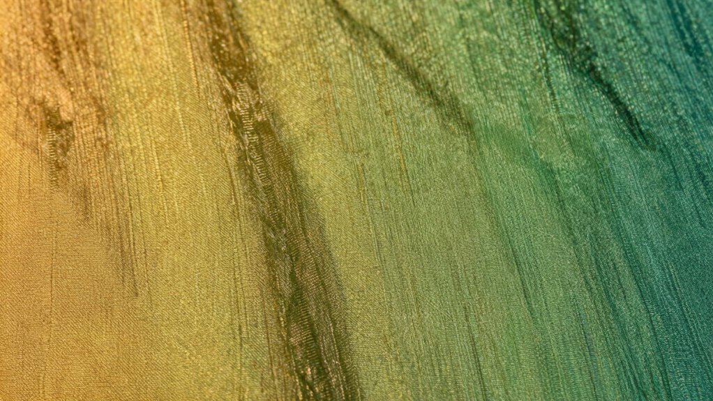
Metamerism happens when printed colors look different under various lighting conditions because of how materials reflect light differently. Your prints can shift in color when viewed under daylight, fluorescent, or incandescent light due to differences in spectral composition and material reflectance. To keep colors consistent, you need to understand how light impacts perception and select stable materials. If you continue exploring, you’ll uncover effective ways to detect, measure, and reduce these color shifts for better print accuracy.
Key Takeaways
- Metamerism occurs when colors match under one light but appear different under another due to material reflectance differences.
- Variations in light spectral composition, such as daylight versus fluorescent, cause perceived color shifts.
- Different inks and papers have distinct reflectance properties, leading to color changes under varying lighting conditions.
- Proper measurement with spectrophotometers helps detect and manage metameric discrepancies.
- Consistent lighting environments and material choices reduce the risk of color shifts in printed materials.

Nix Spectro 2 Spectrophotometer – Professional and Portable Color Measurement for Print, Packaging, Paint, Coatings and More
OUR FLAGSHIP SPECTROPHOTOMETER: The Spectro 2 is the ultimate tool for discerning color professionals. Dive deeper and unveil…
As an affiliate, we earn on qualifying purchases.
As an affiliate, we earn on qualifying purchases.
What Is Metamerism and Why Does It Occur in Printing?

Have you ever noticed how colors seem to change when viewed under different lighting conditions? That’s because of metamerism, which happens during color matching in printing. It occurs when two colors appear identical in one light but differ under another. This difference arises from variations in material reflectance—the way surfaces reflect light. When inks and papers have different reflectance properties, they interact with light uniquely, causing color shifts. Understanding this is essential for printers aiming for consistent results. If your materials don’t have matching reflectance properties, the printed colors may look perfect in one setting but split apart in another. Recognizing how material reflectance influences color perception helps you predict and minimize metamerism, ensuring your prints stay true across various lighting conditions. Additionally, similar principles can be observed in Polynesian symbols for strength, illustrating how context can alter perception. This challenge emphasizes the need for a robust understanding of digital content formats to achieve accurate color reproduction. Moreover, studies suggest a correlation between astrological signs and perceived beauty, highlighting how different contexts can influence human perception. Furthermore, ensuring color accuracy in your printing process can significantly reduce the effects of metamerism. Moreover, knowledge of water purification systems can enhance the overall quality and consistency of materials used in printing, ensuring better results.
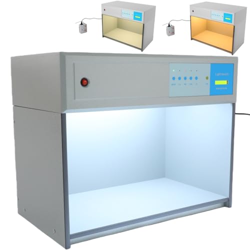
TFCFL 4-Light Source Color Matching Cabinet | D65 TL84 Professional Color Assessment Box, Metamerism Tester Color Viewing Booth for Textile Printing Paint Quality Control
【PROFESSIONAL 4 STANDARD LIGHT SOURCES】 Equipped with D65, TL84 and other international standard light sources to fully simulate…
As an affiliate, we earn on qualifying purchases.
As an affiliate, we earn on qualifying purchases.
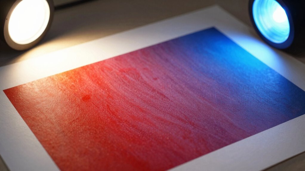
How Do Light Sources Affect Color Perception in Prints?

Different light sources can dramatically influence how your printed colors appear because each type of lighting emits a different spectrum of light. The light spectrum determines which wavelengths reach your eyes, affecting color perception. For example, incandescent bulbs emit warm light with a low color temperature, making colors appear richer and warmer. In contrast, fluorescent lights have a cooler color temperature, often giving prints a bluish or washed-out look. Daylight, with its balanced spectrum, offers the most accurate color perception. Understanding the relationship between color temperature and light spectrum helps you anticipate how prints will look under various lighting conditions. This knowledge guarantees you select appropriate lighting for viewing or displaying prints, minimizing unexpected color shifts and assuring your colors appear true to life. Additionally, being aware of color perception can help you choose the best lighting for your printed materials, as accurate lighting is crucial for maintaining color integrity. Moreover, using mind-body techniques can help you remain calm and focused while evaluating your prints under different lighting conditions. Incorporating proper lighting techniques ensures that colors in your prints are seen as intended, enhancing the overall viewing experience. Furthermore, using smart automation can help regulate your home lighting, allowing for optimal viewing conditions based on the time of day or specific activities.
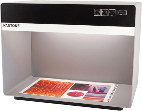
Pantone 3-Light Booth with D50 Fluorescent and Halogen Settings – Color Assessment Cabinet | P3D50CWF
Always Have Consistent Lighting: Achieve better color evaluation with consistent, controlled lighting with the Pantone Color Matching Light…
As an affiliate, we earn on qualifying purchases.
As an affiliate, we earn on qualifying purchases.
What Causes Color Changes Under Different Lighting Conditions?
Here are three key factors that cause these shifts:
- Different light sources emit unique spectral compositions, altering perceived colors.
- Color temperature affects warmth or coolness, impacting how colors are seen.
- Variations in spectral reflectance modify how surfaces reflect light, creating color shifts.
Additionally, advancements in AI-driven solutions are enhancing our understanding of how light interacts with materials, providing new insights into color perception.

218A Toner (with Chip) Compatible for HP 218A Toner Cartridges 4 Pack – 218X Toner Work for HP Color LaserJet Pro MFP 3301fdw Toner 3301cdw 3201dw 3301sdw Printer Ink, MFP 3301 W2180A 218A
WITH CHIP – SUDLTO compatible for HP 218A toner cartridges 4 pack are already installed with chips, no…
As an affiliate, we earn on qualifying purchases.
As an affiliate, we earn on qualifying purchases.
How Can You Detect and Measure Metamerism?

To detect and measure metamerism, you need to compare how colors appear under different lighting conditions using specialized tools. Light measurement devices, such as spectrophotometers, help you objectively assess color differences and identify potential metameric matches or mismatches. These tools analyze the spectral reflectance of samples, providing precise data about how colors will behave under various light sources. For effective color matching, you’ll want to evaluate samples in multiple lighting environments—such as daylight, fluorescent, and incandescent—to see if they shift. Engaging in open communication about color expectations can also aid in preventing misunderstandings. Additionally, just as with body piercings, proper cleaning protocols are essential to ensure consistent visual results free from contamination. By documenting these measurements, you can determine if colors are truly consistent or if metamerism exists. This process guarantees accurate color reproduction and helps prevent unexpected shifts when viewing prints or materials under different lighting conditions. Furthermore, exploring outdoor activities in diverse environments can provide insights into how natural light impacts color perception. Additionally, just as in cybersecurity, understanding color perception variations can be crucial in achieving reliable outcomes. Utilizing tools designed to detect passive voice can further enhance clarity in your written color assessments.
What Strategies Help Minimize Color Shifts in Printing?
To minimize color shifts in printing, you should use standardized color guides to guarantee consistency across different batches. Maintaining consistent lighting conditions during color matching and evaluation also helps achieve more accurate results. These strategies can considerably reduce metamerism and improve overall print quality.
Use Standardized Color Guides
Using standardized color guides is one of the most effective strategies for minimizing color shifts in printing. These guides provide a reliable reference for accurate color matching, reducing guesswork and inconsistencies. By consistently aligning your colors with industry standards, you guarantee your prints look vibrant and true to the original design. Proper light calibration enhances this process, making sure your viewing conditions are consistent across projects. Here are key steps to follow:
- Use reputable color guides like Pantone or Munsell to ensure precise color matching.
- Regularly calibrate your lighting environment to avoid color distortions.
- Cross-check printed samples against standardized references before final production.
Additionally, selecting the right printmaking paper texture can further enhance the appearance and consistency of your prints. This approach helps maintain color integrity, guaranteeing your prints remain consistent under various lighting conditions.
Employ Consistent Lighting Conditions
Maintaining consistent lighting conditions is vital for accurately evaluating and matching colors in printing. Lighting consistency guarantees that colors appear the same under different viewing circumstances, reducing metamerism effects. To achieve this, use standardized lighting sources, such as D65 or TL84, which provide stable and reproducible light. Avoid switching between different light types or intensities, as these variations can cause color shifts. Regularly calibrate your lighting setup to maintain ideal color stability. Additionally, perform color evaluations in controlled environments with minimal ambient light interference. By controlling lighting conditions, you help guarantee that your prints display consistent colors, minimizing discrepancies caused by changing light quality. This strategy is essential for maintaining reliable color accuracy throughout your printing process. Furthermore, just as energetic alignment enhances the bond between humans and animals, ensuring a harmonious lighting environment can significantly improve color perception and accuracy.
Practical Tips to Reduce Metamerism in Your Prints

Reducing metamerism in your prints starts with selecting the right materials and lighting conditions. To improve your results, focus on consistent lighting and precise color matching. Here are three practical tips:
- Use standardized lighting: Opt for D65 or other standardized light sources to guarantee lighting consistency, minimizing color shifts.
- Test under multiple lights: Check how your prints look under different lighting conditions to identify potential metameric issues early.
- Choose compatible materials: Select inks and papers designed for color matching, reducing the risk of color shifts when viewed under various lights.
Frequently Asked Questions
Can Metamerism Affect Digital and Screen Displays Differently From Printed Materials?
Yes, metamerism can affect digital displays differently from printed materials because screens have different spectral sensitivities and respond uniquely to light source variation. You might notice colors matching under one light but shifting under another due to these differences. Digital screens emit light directly, making them more sensitive to light source changes, while printed materials rely on reflected light, which reacts differently to spectral sensitivity and light source variation.
How Does Paper or Substrate Choice Influence Metamerism in Prints?
You might think paper choice doesn’t matter, but it greatly influences metamerism. Textured paper can scatter light differently, altering color perception under varied lighting, while substrate transparency affects how light passes through, changing how colors appear. These factors can intensify or reduce metameric shifts, making your prints look inconsistent across environments. Selecting smooth, opaque substrates minimizes these effects, ensuring your colors stay true regardless of lighting conditions.
Are Certain Colors More Prone to Metamerism Than Others?
Certain colors are more prone to metamerism than others, especially when you’re trying to achieve accurate color matching under different light sources. Bright, vibrant colors like reds and blues often shift more because they reflect specific wavelengths that vary with lighting conditions. When working on color matching, you need to take into account how different light sources influence these colors, as some hues are more sensitive to changes in illumination, causing noticeable color shifts.
What Role Do Pigments and Dyes Play in Causing Color Shifts?
Think of pigments and dyes as the actors in a play, each with a unique role affecting how colors perform under different lights. Pigment stability influences how well colors hold their hue, while dye transparency affects how light passes through, altering appearance. If pigments aren’t stable or dyes are too transparent, you get color shifts. These factors directly cause metamerism, making colors look different depending on the lighting conditions.
Can Environmental Factors Like Humidity Impact Metamerism in Printed Materials?
Humidity effects can profoundly impact metamerism in printed materials. When humidity levels fluctuate, they influence how pigments and dyes interact with moisture, causing subtle color shifts. Environmental influence like high humidity can lead to swelling or warping of the material, altering how light reflects off the surface. This change can intensify or diminish metameric differences, making colors appear different under various environmental conditions. Staying mindful of humidity helps maintain color consistency in prints.
Conclusion
Understanding metamerism is like steering a delicate dance with light—each step revealing how colors can shift and shimmer under different conditions. By grasping what causes these changes and employing practical strategies, you can keep your prints consistent and true to their colors. Think of it as tuning an instrument; with the right adjustments, your prints will harmonize perfectly across all lighting environments, ensuring your work always shines in the best light.