
To blend colors in screen printing effectively, start with primary inks—red, blue, yellow—and gradually combine them to create secondary and tertiary hues. Use transparent mediums for evaluation and add small amounts of inks, stirring thoroughly after each addition. Test your mixed colors on sample fabrics under different lighting to guarantee vibrancy and accuracy. Mastering these techniques boosts your print quality, and if you continue, you’ll learn more about developing a vibrant, consistent color palette.
Key Takeaways
- Start with primary colors and mix gradually, adding small amounts to achieve desired hues.
- Use transparent mediums or clear base inks to evaluate color blends before printing.
- Keep detailed notes of color ratios to ensure consistency across prints.
- Test mixed colors on sample fabrics under different lighting conditions to verify vibrancy and accuracy.
- Understand color theory and contrast to select effective color combinations and enhance print quality.
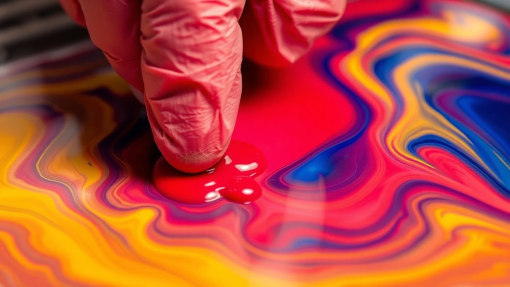
Understanding how to mix colors in screen printing is essential for achieving vibrant and accurate results. When you master color blending techniques, you gain the ability to create a wide spectrum of hues that match your design vision perfectly. The key begins with choosing the right color palette, which sets the foundation for successful mixing. Your color palette selection should be deliberate, considering the mood, branding, and desired vibrancy of your final print. Start with primary colors—red, blue, and yellow—as these are the building blocks for most other shades. From there, you can experiment with mixing to produce secondary and tertiary colors, expanding your range without needing an excessive inventory of inks.
Mastering color mixing in screen printing begins with choosing a deliberate, well-planned palette.
As you work on blending, remember that consistency is vital. Use transparent mixing mediums or clear base inks to evaluate how colors combine. This approach helps you see the true result of your mixes without the interference of opaque bases. When blending, add small amounts of one color into another gradually, stirring thoroughly each time. This incremental approach ensures you can control the shade and avoid overshooting your target hue. Keep detailed notes on your ratios so you can replicate successful mixes for future projects.
In terms of color blending techniques, you might explore methods like dry blending—where inks are mixed on a palette before printing—or wet blending, which involves combining colors directly on the substrate during printing. Dry blending offers more control, especially for complex or precise shades, while wet blending can produce unique gradient effects and subtle transitions. Whichever method you choose, always test your mixed colors on sample fabrics before starting the main run. This step allows you to see how the colors appear once cured and under different lighting conditions. Additionally, understanding the importance of color theory can help you make more informed choices about hue, saturation, and contrast to enhance your final prints.
Your color palette selection also influences how you approach blending. If you’re working with a limited palette, you’ll need to be more strategic about mixing to maximize your options. Conversely, a broader palette gives you more flexibility but requires careful planning to prevent muddy or dull colors. Ultimately, understanding how to effectively mix colors in screen printing involves a combination of thoughtful palette selection and mastering blending techniques. With practice, you’ll develop an intuitive sense for color harmony, enabling you to produce vibrant, accurate prints that truly stand out.
Frequently Asked Questions
How Do I Prevent Colors From Bleeding During Printing?
To prevent colors from bleeding during printing, focus on maintaining proper ink consistency and practicing color bleed prevention techniques. Use inks that are not too thick or too runny, and make certain they’re mixed thoroughly for even application. Adjust your squeegee pressure and speed to avoid pushing ink too far. Also, consider pre-treating your substrate and drying each layer properly before adding new colors, reducing the risk of bleeding.
What Types of Inks Are Best for Vibrant Color Mixing?
You should choose plastisol or water-based inks for vibrant color mixing, as they offer excellent color matching and consistent ink formulation. These inks allow you to blend and layer colors effectively, producing vivid results. Investigate the idea that high-quality inks with the right formulation improve color vibrancy, and you’ll find that selecting the best inks enhances your ability to create bright, eye-catching designs with accurate color blending.
Can I Mix Colors Directly on the Screen?
Yes, you can mix colors directly on the screen, but you’ll need to be precise for good color matching. Make certain your ink consistency is just right—thick enough to prevent bleeding but thin enough for smooth application. Test your mixed colors on sample fabric first to see how they look when printed. This way, you maintain control over the final result and achieve vibrant, accurate colors in your design.
How Do Environmental Factors Affect Color Mixing Accuracy?
Environmental conditions can markedly impact your color mixing accuracy. If humidity or temperature fluctuate, pigment stability may be compromised, leading to inconsistent colors. You might think it’s minor, but these factors can cause your mixed inks to shift shades or dry unevenly. To guarantee vibrant, consistent results, control your workspace climate, store inks properly, and monitor environmental conditions regularly. This way, your colors stay true and your prints look professional.
What Tools Help Achieve Precise Color Blends?
To achieve precise color blends, you should use tools like a color matching system and a scale to measure ink accurately. These tools help you maintain consistent ink consistency and guarantee your colors blend perfectly. Using a spectrophotometer can also fine-tune your color matching, reducing errors. With these tools, you can control the mixing process better, resulting in vibrant, accurate colors that meet your design expectations every time.
Conclusion
So, now that you’re a master of mixing colors in screen printing, go ahead and create that stunning masterpiece. Just remember, if your colors turn out a little… unexpected, blame it on the mischievous pigments plotting against you. After all, who knew mixing inks could be so unpredictable? Embrace the chaos, enjoy the vibrant mess, and proudly display your “unique” artwork—because nothing says “professional” like a color disaster turned masterpiece. Happy printing!