Colors often don’t match what you see because of various factors like screen technology, calibration settings, and environmental lighting. Differences in display panels, color gamuts, and source profiles affect how colors look on your device. Ambient lighting, glare, and reflections can also distort perception. To get closer to real colors, you need proper calibration and controlled viewing conditions. If you want to understand how to improve color accuracy, there’s more to explore that can help you achieve better results.
Key Takeaways
- Variations in display technology, resolution, and color gamut cause differences in how colors appear across screens.
- Ambient lighting, reflections, and environmental conditions distort perceived colors, leading to mismatches.
- Inconsistent calibration and outdated color profiles result in inaccurate color reproduction on displays.
- Device limitations and different color processing technologies affect how colors are rendered and perceived.
- Lack of controlled viewing conditions and improper settings contribute to discrepancies between digital images and real-world colors.
datacolor Spyder – Monitor Calibrator for Graphic Designers, Photographers, and Content Creators, Shows You True Colors, Works on OLED Monitors & LED Screens, Easy-to-Use Color Calibration Tool
Color “Surprises” Are a Thing of the Past: Datacolor’s exclusive DevicePreview TM Beta feature simulates what your photos…
As an affiliate, we earn on qualifying purchases.
As an affiliate, we earn on qualifying purchases.
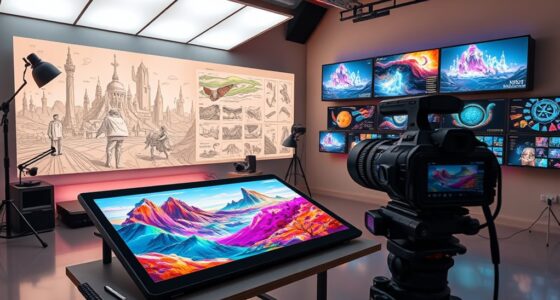
Why Do Colors Look Different on Your Screen?

Colors often look different on your screen because of how displays reproduce images. Your device’s screen resolution plays a big role—higher resolutions provide more detail and accurate color rendering, while lower resolutions can cause colors to appear muddled or less vibrant. Additionally, color psychology influences how you perceive these colors; your brain interprets hues based on context and surroundings, which can alter your perception. Different screens also have varying color gamuts, meaning some can display a wider range of colors than others. This inconsistency makes it challenging to trust what you see as true. So, the combination of screen resolution, display technology, and even your psychological response shapes how colors appear on your device, often making them look different from real-world or printed colors. Exploring digital concepts can further illuminate these differences in color perception.
datacolor Spyder – Monitor Calibrator for Graphic Designers, Photographers, and Content Creators, Shows You True Colors, Works on OLED Monitors & LED Screens, Easy-to-Use Color Calibration Tool
Color “Surprises” Are a Thing of the Past: Datacolor’s exclusive DevicePreview TM Beta feature simulates what your photos…
As an affiliate, we earn on qualifying purchases.
As an affiliate, we earn on qualifying purchases.
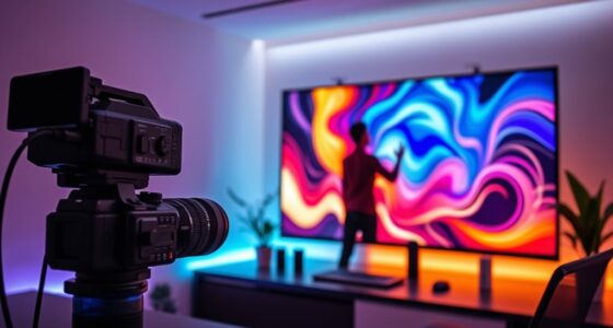
How Ambient Lighting Affects Your Color Perception

Ambient lighting plays a crucial role in how you perceive colors on your screen because it influences the contrast and brightness around your device. The color temperature of your environment, whether warm or cool, can make colors appear different than they actually are. Warm lighting adds a yellowish hue, softening colors, while cool lighting introduces a bluish tint, making images look more stark. Additionally, the choice of ride clothes can impact how colors are perceived under different lighting conditions. Incorporating elements like fire pits and outdoor ovens in your environment can further enhance the overall atmosphere, affecting your color perception. Understanding the impact of ambient lighting is essential for both art and design, as it significantly influences color perception. Ambient reflections from nearby surfaces also impact perception by introducing unwanted color casts or glare, which can distort your view. These reflections and the overall color temperature create a context that influences how your brain interprets on-screen colors. To see true colors, minimizing ambient reflections and controlling your environment’s color temperature is essential. Additionally, understanding the importance of support and boundaries in your viewing environment can help you create a space that enhances color accuracy. Achieving accurate color representation requires a projector with high color accuracy, which ensures that the displayed colors closely match the intended hues.

Quntis Computer Monitor Lamp, Screen Monitor Light Bar for Eye Caring, USB Reading LED Task Lamp with Auto-Dimming, Dimmable Light Bar, Touch Control, No Glare Space Saving Home Office Desk Lamps
No Blue Light Hazard & Flicker-Free Lighting: Certified to meet the IEC/TR 62778 and IEC/EN 62471 standards, Quntis…
As an affiliate, we earn on qualifying purchases.
As an affiliate, we earn on qualifying purchases.
How to Calibrate Your Display for Better Color Accuracy
To improve your color accuracy, start by adjusting your display’s brightness to match your environment. Then, use calibration tools or software to fine-tune your colors and verify they’re accurate. Additionally, maintaining your kitchen gear can ensure that colors in your environment remain vibrant and true. This is especially important because media literacy helps you understand how colors can be manipulated in digital content. Furthermore, being aware of Frühwarnzeichen für Brustkrebs can enhance your understanding of how colors impact perceptions in various contexts. Finally, set the correct color profile for your display to maintain consistent, true-to-life colors across your devices. Additionally, consider using outdoor cooling fans to reduce glare from sunlight when calibrating your display in bright environments. For optimal results, explore vinyl cutter settings to ensure that colors are accurately represented in your craft and design projects.
Adjust Brightness Settings
Adjusting your brightness settings is a crucial step in calibrating your display for more accurate colors. When your screen’s brightness is too high or low, it skews how colors appear and affects your perception of color temperature and screen refresh. Find a comfortable level where blacks are deep without losing detail, and whites don’t look washed out. Proper brightness helps your eyes relax and ensures colors stay true. Use the table below to reflect your current feelings about your screen’s brightness:
| Too Dark | Just Right | Too Bright |
|---|---|---|
| Dull colors | Vibrant, balanced | Washed out, harsh |
| Eye strain | Comfortable viewing | Glare, discomfort |
| Loss of detail | Clear contrast | Overexposure |
| Unnatural hues | Accurate shades | Color distortion |
| Fatigue | Invigorating display | Eye fatigue |
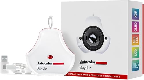
Use Calibration Tools
Using calibration tools is one of the most effective ways to guarantee your display shows accurate colors. Calibration software guides you through adjusting your monitor’s settings, aligning them with standard color theory principles. This process assures your screen displays true-to-life hues, which is vital for color-sensitive work like photography and design.
To enhance precision, consider these calibration steps:
- Use high-quality calibration software compatible with your device
- Follow on-screen prompts to adjust brightness, contrast, and gamma
- Regularly recalibrate to account for display aging
- Cross-check colors with reference images or test charts
Set Correct Color Profiles
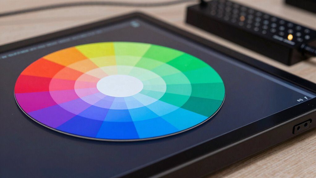
Setting the correct color profile on your display is essential for achieving accurate colors. A proper profile guarantees your screen’s colors align with how your device interprets color information, based on color theory principles. Just like pigment mixing, digital color accuracy depends on understanding how colors combine and appear under different profiles. Without the right profile, your display may exaggerate or dull hues, causing mismatched colors when editing or viewing images. To set it correctly, choose a standard profile like sRGB or Adobe RGB, which are widely supported and reliable. This calibration helps your monitor replicate colors more precisely, ensuring consistency across devices and media. Accurate color profiles are the foundation for true-to-life visuals, making your work look exactly as intended.

Calibrite Display 123 Monitor Calibration Colorimeter for Photo Editing and Color Accurate Viewing, Easy 1 2 3 Software Workflow, USB C Connection, and Before and After Check, Supports 2 Displays
SPECIFICATIONS: Monitor calibration colorimeter with Easy 1 2 3 software workflow, USB C connection, compact body approx. 34mm…
As an affiliate, we earn on qualifying purchases.
As an affiliate, we earn on qualifying purchases.
How Different Screen Technologies Impact Color Matching
How Different Screen Technologies Impact Color Matching
Different screen technologies, like LCD, OLED, and IPS, each have unique display panel variations that affect how colors appear. These differences can make color calibration a challenge, especially across devices with different tech. Additionally, each technology offers a specific color gamut, which influences how vibrant or accurate your colors can look. Understanding this work-life harmony can help you appreciate the importance of matching colors across devices for a more cohesive digital experience. Furthermore, the rise of sustainable materials in tech design can also impact color representation and user perception, affecting overall visual experience. For example, design principles such as contrast and balance play a crucial role in how we perceive colors on different screens, while the use of filter sizing in water systems can illustrate how fine-tuning parameters enhances the overall effectiveness of a system. Dogs need regular exercise to maintain a healthy weight and prevent behavioral issues, just as understanding screen technology can enhance our visual experience.
Display Panel Variations
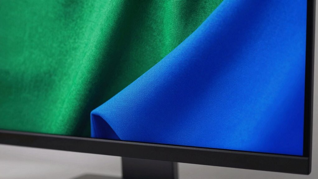
When it comes to matching colors across screens, the type of display panel you’re using makes a huge difference. Different panels—like LCD, OLED, and IPS—affect how colors are rendered, impacting your ability to match colors accurately. Each technology has unique properties related to color theory, color accuracy, and contrast. Additionally, screen resolution influences how sharp and detailed colors appear, affecting visual consistency. For example, OLED screens often produce richer blacks and more vivid colors, whereas LCD panels may struggle with color depth. Understanding these variations helps you select the right display for precise color work. Factors like panel type and resolution shape how your screen displays hue, saturation, and brightness, directly influencing your color-matching success.
Moreover, having a solid support network can help you navigate challenges related to color accuracy in design projects.
Color Calibration Challenges
Color calibration becomes particularly challenging because each screen technology processes and displays colors differently, often leading to inconsistencies. These differences stem from how various displays handle light, color depth, and contrast, which directly affect color accuracy. Understanding color theory is essential, as it guides how colors should appear and interact visually, but each device interprets these principles uniquely. Additionally, color psychology influences how colors evoke emotions and perceptions, making accurate calibration critical for consistent messaging. Even small variations in color output can alter the intended mood or emphasis. As a result, achieving perfect color matching across different screens requires meticulous adjustments, awareness of each technology’s limitations, and a solid grasp of how colors are perceived and processed visually. Moreover, knowing the watt-hours and capacity of the devices can further enhance your understanding of their display capabilities. Regularly checking color accuracy standards can also help ensure that your devices are producing the most faithful representations of colors. Incorporating natural light into your space can also significantly influence how colors are perceived, enhancing the overall aesthetic.
Technology-Specific Color Gamut
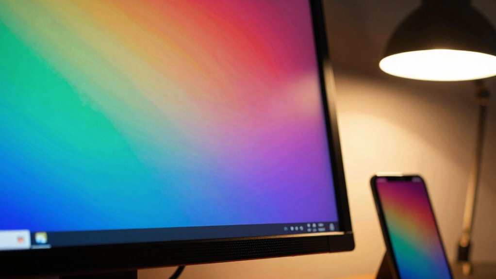
Since screens use various technologies to display images, each one has its own color gamut—fundamentally, the range of colors it can reproduce. Different display types, like LCD, OLED, or LED, operate within specific color spaces, limiting the colors they can produce. This variation impacts color matching, especially if your device’s color depth isn’t sufficient to display subtle gradients or hues accurately. For example, some screens support wider gamuts like DCI-P3 or Adobe RGB, offering richer color reproduction. Consequently, the colors you see depend on these technical constraints. Understanding a screen’s color space and color depth helps you anticipate how colors may differ across devices. This knowledge is crucial for achieving consistent color matching, particularly in professional workflows.
Settings That Can Disrupt Accurate Colors on Your Device
Certainly! Here’s the revised content with the addition:
—
Certain settings on your device can substantially throw off color accuracy, making your display appear different from what it’s supposed to show. Brightness, contrast, and color temperature adjustments can distort how colors appear, affecting your perception of color psychology and color symbolism. For example, overly warm or cool tones can alter the emotional impact of colors, skewing their intended meaning. Additionally, automatic brightness or adaptive color settings might change based on ambient light, leading to inconsistencies. Screen calibration settings, if misconfigured, can also cause color discrepancies. These adjustments can interfere with your ability to accurately interpret colors, especially in tasks like photo editing or design. Ensuring these settings are correctly calibrated helps maintain true color representation and preserves the integrity of color psychology and symbolism. Furthermore, high-speed storage solutions can enhance your workflow by ensuring that color profiles and settings are swiftly accessed and applied.
—
Let me know if you need any more changes!
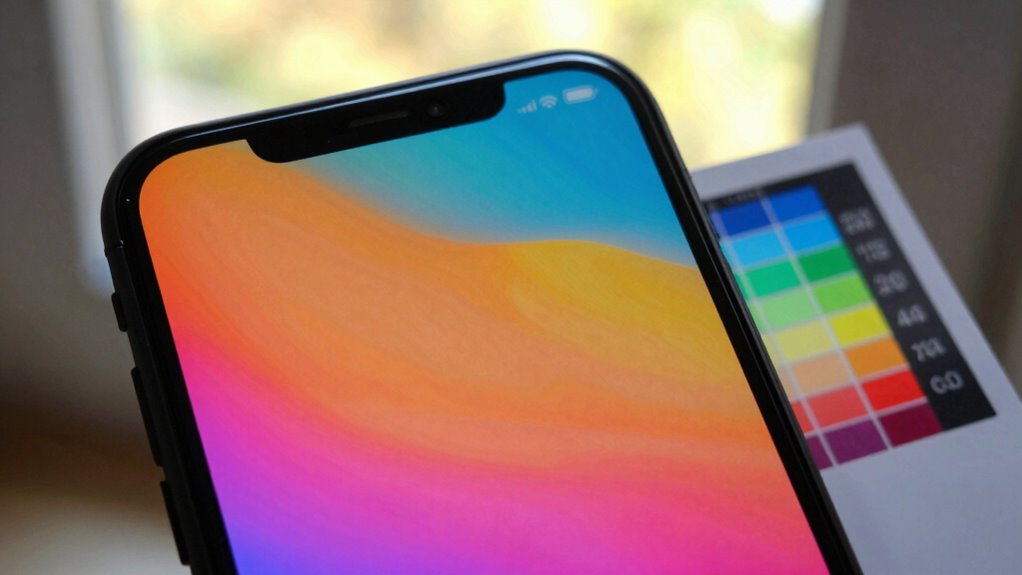
Tips to Make Your Screen Colors Match Reality

To make certain your screen displays colors accurately, start by calibrating your device properly. This involves adjusting brightness, contrast, and color balance, ensuring your display reflects real-world tones. Use calibration tools or software for precise settings. Consider color psychology principles to understand how hues influence perception, helping you choose accurate shades for artistic editing. Consistently viewing your screen in natural light minimizes discrepancies. Additionally, regularly update your display drivers and calibration profiles to maintain color fidelity. For creative work, always verify colors against a physical color reference or print. This approach ensures your digital and physical colors align, reducing misinterpretations and improving overall image accuracy.
Regularly checking and cleaning your air purifier filters can also enhance the accuracy of colors displayed, as cleaner air reduces the potential for color distortion caused by dust particles. Furthermore, using high-quality accessories can improve your viewing experience by ensuring optimal performance. Remember that comparative advantage in selecting your display technology can greatly affect visual output quality.
- Use professional calibration tools or software
- Review your display in natural lighting
- Apply color psychology insights for better accuracy
- Regularly update your calibration profiles
Frequently Asked Questions
Can Color Blindness Affect How I Perceive On-Screen Colors?
Yes, color blindness can affect how you perceive on-screen colors. It influences your color vision, leading to perception differences that might make certain hues appear muted or similar. You may struggle distinguishing between reds and greens or other color combinations, depending on your type of color blindness. Understanding these perception differences can help you adjust settings or use filters to improve your viewing experience.
Do Different Operating Systems Display Colors Differently?
Yes, different operating systems can display colors differently because of variations in color calibration and display technology. You might notice discrepancies if one OS uses a different color profile or has unique default settings. To minimize this, make sure your display is properly calibrated and use consistent color profiles across devices. Updating your graphics drivers and choosing compatible display technology can also help achieve more uniform color representation.
How Does Screen Resolution Impact Color Accuracy?
Screen resolution itself doesn’t directly impact color accuracy, but it can influence how sharp and detailed your display appears. To guarantee true colors, you should perform proper color calibration, which adjusts your display’s color output. Additionally, ambient lighting plays a big role; dim or colored lighting can distort how you perceive colors. Keep your environment consistent and calibrate regularly for the most accurate color representation.
Are There Specific Color Profiles for Professional Editing?
Like a master chef selecting the finest ingredients, you should choose specific color profiles for professional editing. These profiles, often based on industry standards like Adobe RGB or sRGB, guarantee accurate color calibration and consistent color temperature. By using these tailored profiles, you make sure your monitor displays true-to-life colors, helping your work look perfect across different devices and print outputs.
Does Screen Size Influence Color Perception Accuracy?
Yes, screen size can influence color perception accuracy because larger screens may require more precise color calibration to maintain consistency. Ambient lighting also plays a significant role, as it affects how you perceive colors on your display. To get accurate colors, you should regularly perform color calibration and control ambient lighting conditions, ensuring your screen’s colors stay true regardless of size or environment.
Conclusion
Understanding why your screen colors don’t match reality can be eye-opening. Did you know that improper calibration can cause color discrepancies of up to 20%? By adjusting your display settings and considering ambient lighting, you can greatly improve color accuracy. Remember, nearly 60% of people don’t calibrate their screens regularly, leading to mismatched colors and miscommunication. Take a few simple steps today to guarantee your screen reflects true colors—your eyes and work will thank you.