To guarantee your iPad artwork remains color-accurate from sketch to print, start by selecting a model with a high-quality display that supports wide P3 color and True Tone. Regularly calibrate your screen with reliable tools and adjust settings based on your environment. Use consistent color profiles when exporting, and communicate clearly with your print shop using embedded profiles and sample proofs. For a complete step-by-step guide, continue exploring these essential tips for a seamless color workflow.
Key Takeaways
- Choose an iPad model with wide P3 color support and True Tone for accurate color representation.
- Regularly calibrate the iPad display with calibration tools to maintain color consistency.
- Manage and embed correct ICC profiles in your files to ensure color fidelity during printing.
- Use consistent lighting and workspace conditions to optimize display calibration and color accuracy.
- Communicate clearly with print shops using color swatches, sample prints, and embedded profiles to prevent surprises.

Apple 2021 iPad Pro 12.9-inch, Wi‐Fi + Cellular, 256GB – Space Gray (Renewed)
Apple M1 chip for next-level performance – Go further with all-day battery life
As an affiliate, we earn on qualifying purchases.
As an affiliate, we earn on qualifying purchases.
Why Color Accuracy Matters for Your iPad Artwork
Have you ever finished an artwork on your iPad only to find that the colors look completely different when viewed on another device or printed? That’s why color accuracy matters. Understanding color theory helps you choose harmonious colors that translate well across screens and prints. When you master pigment matching, you guarantee your digital colors match physical ones, avoiding surprises during printing. Without accurate color representation, your artwork might lose its intended mood or impact. Precise color management lets you see how colors truly appear, reducing guesswork. This consistency builds trust in your work and saves time in revisions. Ultimately, prioritizing color accuracy helps you produce artwork that looks just as stunning outside your device as it does on your screen.

Kaisi Professional Electronics Opening Pry Tool Repair Kit with Metal Spudger Non-Abrasive Nylon Spudgers and Anti-Static Tweezers for Cellphone iPhone Laptops Tablets and More, 20 Piece
Kaisi 20 pcs opening pry tools kit for smart phone,laptop,computer tablet,electronics, apple watch, iPad, iPod, Macbook, computer, LCD…
As an affiliate, we earn on qualifying purchases.
As an affiliate, we earn on qualifying purchases.
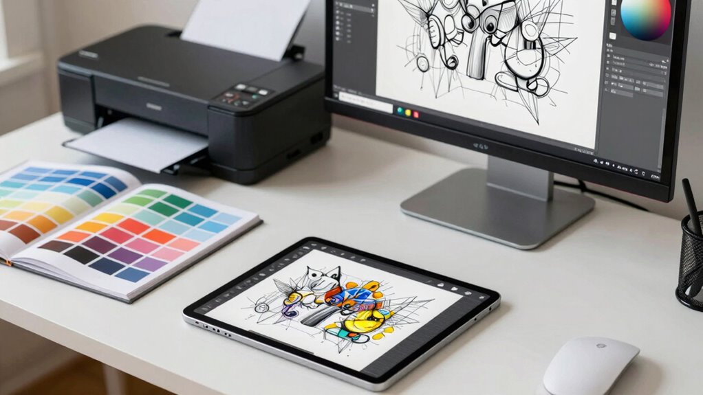
Choosing the Best iPad Model for Color Work
When selecting an iPad for color work, prioritize models with high-quality, accurate displays that can handle your color needs precisely. You’ll also want a device with strong performance and compatibility to run your creative apps smoothly. Making the right choice guarantees your workflow remains efficient and your colors stay true. Additionally, utilizing digital concepts can help enhance your overall creative process. For instance, understanding color accuracy is essential to ensure your projects translate well across different mediums.
Display Quality and Accuracy
Choosing the right iPad model for color work hinges on display quality and accuracy. A high-quality display guarantees your colors align with true color theory, reducing surprises when printing or sharing your work. Look for models with wide P3 color support and True Tone technology, which provide a broader color gamut and adaptive color calibration. These features help your artwork stay consistent across devices and lighting conditions, fueling your artistic inspiration without guesswork. Accurate color representation allows you to focus on creativity rather than technical limitations, making it easier to develop a cohesive color palette. Investing in a display with excellent color accuracy is essential for achieving professional results, ensuring your sketches, digital paintings, and final prints match your original vision. Additionally, consider incorporating features like landscaping to enhance natural beauty in your workspace for a more inspiring environment.
Performance and Compatibility
A powerful display alone isn’t enough if your iPad can’t keep up with your workflow. Performance and compatibility are essential for seamless editing and accurate color work. A faster processor ensures smooth handling of complex color theory tasks, detailed sketches, and layered projects without lag. Compatibility with styluses, apps, and external peripherals also matters, especially when translating your artistic inspiration into precise colors. Look for models with ample RAM and storage to manage large files and high-resolution images efficiently. An iPad with robust performance supports your creative process from initial concept to final print, preventing frustration and delays. Choosing the right model guarantees your tools won’t hold you back, allowing you to focus on perfecting your color accuracy and artistic vision.

ICC
ICC
As an affiliate, we earn on qualifying purchases.
As an affiliate, we earn on qualifying purchases.
Setting Up Your iPad Display for Accurate Colors
To guarantee your iPad displays colors accurately, you need to calibrate it regularly and adjust settings like brightness and contrast. Enabling True Tone and Night Shift helps maintain consistent color perception across different lighting conditions. These steps will keep your display aligned with professional color standards for reliable work. Additionally, consider using color calibration tools to further enhance accuracy and ensure your work appears as intended in various formats.
Calibrate Your Display Regularly
Regularly calibrating your iPad display guarantees that colors stay true to life, which is essential for accurate editing and color-sensitive work. Consistent color calibration helps maintain display consistency, ensuring your colors remain reliable over time. To achieve this, use built-in calibration tools or third-party apps designed for color accuracy. Regular checks allow you to identify and correct any shifts in color reproduction, preventing surprises when printing or sharing your work. Keep in mind that environmental factors like lighting can affect your perception, so calibrate in a neutral setting. By maintaining a routine calibration schedule, you verify your iPad’s display delivers consistent, accurate colors, supporting your creative process from initial sketch to final print with confidence.
Adjust Brightness and Contrast
Adjusting your iPad’s brightness and contrast settings is essential for guaranteeing your display shows colors accurately. Proper adjustments help align with color theory principles and support effective color psychology, preventing misinterpretations of your artwork’s intent. When setting brightness, consider ambient lighting—avoid overly bright or dim environments that distort color perception. Contrast adjustments sharpen or soften details, impacting how hues interact on your screen. Visualize these adjustments as:
- A soft glow highlighting subtle shades in a pastel palette
- Crisp lines that make bold colors pop
- Balanced tones that reflect true skin hues or natural scenery
These tweaks ensure your display mirrors real-world colors, reducing surprises in the print stage. Accurate brightness and contrast create a stable foundation for working with color, helping you trust your iPad as a color-accurate tool. Additionally, engaging in regular stain removal techniques can keep your iPad screen clean, further enhancing color accuracy.
Enable True Tone & Night Shift
Sure! Here’s your revised content with the requested updates:
—
Once you’ve fine-tuned your brightness and contrast, optimizing your display’s color accuracy involves enabling features like True Tone and Night Shift. True Tone adjusts the display’s color temperature based on ambient lighting, ensuring colors appear natural across different environments. Additionally, fact-checking and media literacy can help you discern color accuracy in digital images versus printed materials. Night Shift reduces blue light in the evening, minimizing eye strain and shifting colors to warmer tones. These settings create a more consistent viewing experience, essential for accurate color work. Additionally, maintaining your ride clothes can prevent distractions, allowing you to focus on color accuracy during your creative process.
| Feature | Purpose | Best Use Case |
|---|---|---|
| True Tone | Adapts color temperature to surroundings | Working in varying lighting conditions |
| Night Shift | Warms display colors to reduce blue light | Evening work or late-night editing |
| Both | Enhance comfort and color consistency | Long sessions requiring visual stability |
—
Let me know if you need any further adjustments!
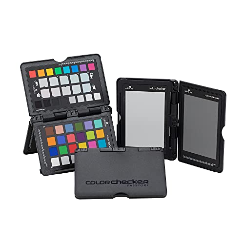
Calibrite ColorChecker Passport Photo 2 Portable Color Calibration Kit for Photo and Video, 4 Target Set for White Balance, Exposure and Camera Profiling, Protective Folding Case with Lanyard (CCPP2)
SPECIFICATIONS: Portable ColorChecker Passport kit with 4 targets for exposure control, custom white balance, camera profiling, and enhancement…
As an affiliate, we earn on qualifying purchases.
As an affiliate, we earn on qualifying purchases.
Calibrating Your iPad Screen: Easy Steps for Consistent Colors
Calibrating your iPad screen guarantees that the colors you see are accurate and consistent across projects. Proper color calibration ensures your display reflects true hues, making your work reliable from sketch to print. To achieve this, start by adjusting the brightness to match your environment. Visualize a palette of vibrant reds, calming blues, and lively greens, all appearing balanced and true. Next, fine-tune the display settings in your device’s calibration tools, focusing on contrast and color temperature. Think of your screen as a canvas, where every shade is precisely placed, ensuring display consistency. Remember, consistent calibration minimizes surprises when printing or sharing your work, preserving color integrity throughout your workflow.
Managing Color Profiles for Printing and Sharing
Having your colors accurately calibrated on-screen is just the first step; managing color profiles guarantees those colors stay consistent when you print or share your work. Properly working with color profiles ensures your device’s color calibration translates accurately across different mediums. Start by embedding ICC profiles into your files to maintain color fidelity. When exporting, select color profiles compatible with your printer or sharing platform, such as Adobe RGB or sRGB. Always verify that your printer or print lab supports the color profile you’re using to avoid surprises. Additionally, keep your color profiles updated and consistent across your workflow to prevent color shifts. Managing these profiles diligently guarantees your artwork’s colors remain true, whether displayed on-screen, printed, or shared online.
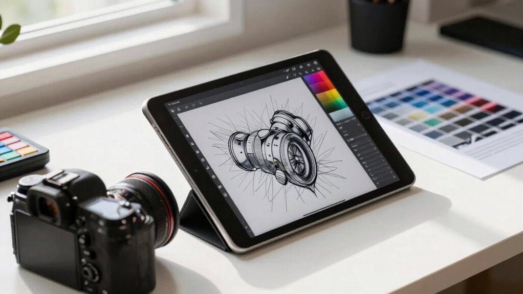
Preparing Your Drawing App for True Color Representation
To guarantee your drawing app displays colors accurately, you need to configure its settings for true color representation from the outset. Start with proper color calibration to verify your iPad’s screen reflects accurate colors. Adjust your device’s display settings and verify color consistency across different lighting conditions. Incorporate the correct color profiles within your app, matching your workflow’s target output, whether screen or print. Visualize this process as:
- Aligning your screen with a professional calibration tool, like a colorimeter, to set a neutral baseline.
- Selecting a color profile that matches your project’s final format, ensuring seamless color translation.
- Regularly updating your device’s calibration and profiles for ongoing accuracy.
This setup ensures your artwork remains true to your vision from sketch to final output. Additionally, understanding the importance of color calibration techniques can significantly enhance your workflow and output quality.
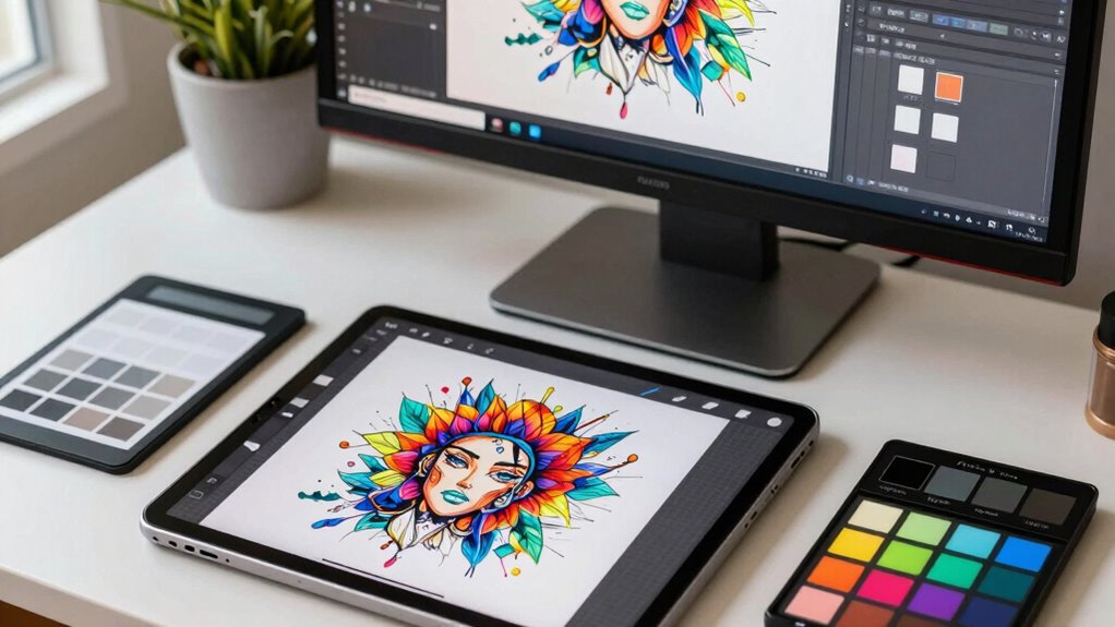
Creating a Smooth Color Workflow From Sketch to Final
Once your drawing app is set up for accurate color display, establishing a seamless color workflow from sketch to final piece becomes the next step. You’ll want to apply color theory principles early to select a cohesive color palette that enhances your artistic inspiration. Use layers to keep your sketch separate from refined colors, allowing you to adjust hues without losing detail. Consistent lighting conditions on your iPad help maintain color accuracy through each stage. Regularly referencing your color swatches ensures continuity from initial sketch to finished work. Keep your workflow organized by labeling color layers and saving specific palettes. This approach streamlines your process, minimizes surprises, and helps you create a polished, color-accurate piece from start to finish.
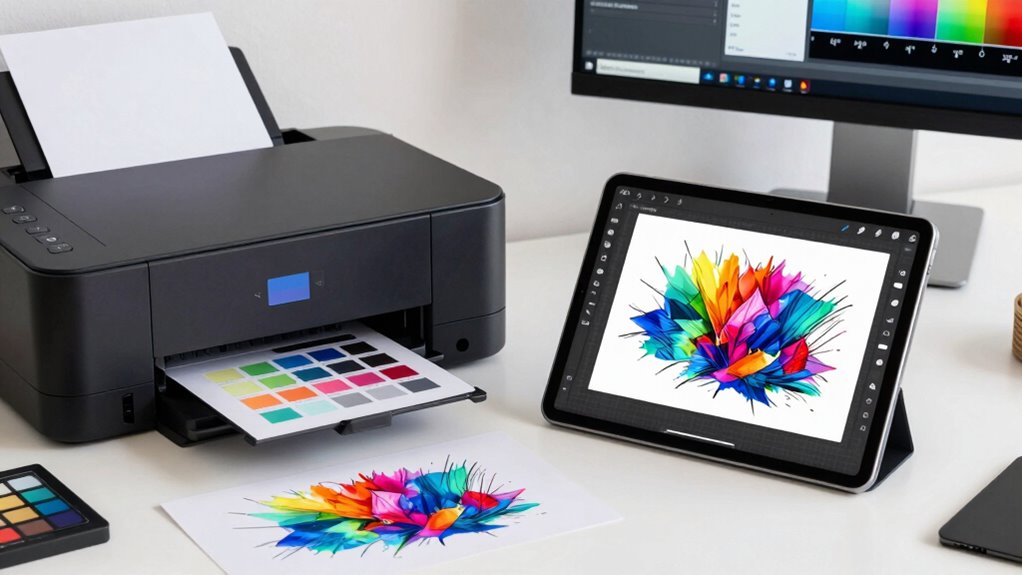
Exporting Files for Accurate Printing Results
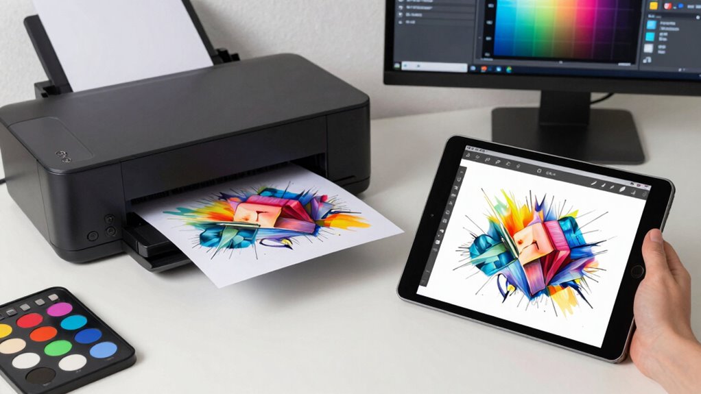
When exporting your files for printing, it’s vital to choose the right color profile settings to guarantee color accuracy. You also need to select the appropriate export format that preserves detail and color fidelity. Making these decisions carefully helps you achieve consistent, professional print results every time.
Color Profile Settings
Ensuring your files display accurate colors when printed starts with selecting the right color profile. Proper color calibration and display calibration are essential for consistent results. When exporting, choose a color profile like Adobe RGB or sRGB, depending on your printer’s requirements. Visualize your file as:
- A vibrant, true-to-life painting matching your screen’s colors
- A precise blueprint that aligns perfectly with print color expectations
- A seamless transition from digital to print without surprises
These profiles help bridge the gap between on-screen display and printed output, ensuring color accuracy. Confirm your iPad’s display calibration to see how your artwork will translate to print. Selecting the correct color profile during export minimizes surprises and guarantees your print matches your original vision.
Export Format Choices
Choosing the right export format is key to maintaining color accuracy and quality in your printed work. When you export your file, consider formats like TIFF or PDF, which preserve color information and support high resolution. These formats help guarantee your color mixing remains consistent from screen to print. Pay close attention to your palette selection; using a color profile embedded in your file assures that the hues you see are true to your intentions. Avoid formats that compress data, like JPEG, which can degrade color fidelity and introduce surprises in the final print. By choosing the appropriate format and maintaining a calibrated color profile, you assure your artwork’s vibrant colors and precise details translate accurately from your iPad to the printed piece.
Communicating With Print Shops to Ensure Color Fidelity
Effective communication with your print shop is essential for achieving color fidelity in your projects. Clear dialogue helps guarantee your artwork aligns with print expectations, considering color theory and color psychology. When discussing your project, visualize key details:
- Color swatches that match your digital palette, used as references for the printer.
- Sample prints to compare and calibrate colors, ensuring consistency.
- File specifications like color profiles and resolution, preventing surprises. Additionally, understanding newborn feeding options can enhance your overall experience when working with online design tools and resources. Exploring cookie preferences can also provide insights into budget considerations for design-related projects. Moreover, being aware of risk management strategies can aid in making informed decisions about your artwork’s presentation and reproduction. Emphasizing the importance of repeatable test protocols can further enrich your discussions, ensuring a shared understanding of color accuracy in your print processes.
Troubleshooting Common Color Discrepancies in Digital Art
Color discrepancies in digital art can be frustrating, but most issues stem from common, fixable causes. One key step is ensuring proper screen calibration; if your iPad’s display isn’t calibrated correctly, colors won’t match your intent. Use calibration tools or apps designed for your device to fine-tune brightness, contrast, and color accuracy. Additionally, check your color calibration across different devices and software, as inconsistencies often cause surprises during printing or sharing. Make sure your color profiles are embedded correctly and consistent throughout your workflow. Regularly calibrate your screen, especially if you notice colors appear off or inconsistent. Addressing these calibration issues helps you identify whether discrepancies come from your display or your color management process, leading to more predictable, color-accurate results.
Frequently Asked Questions
How Often Should I Recalibrate My iPad Display for Optimal Color Accuracy?
You should recalibrate your iPad display every four to six weeks to maintain ideal color accuracy. Regular display calibration guarantees consistent color, which is essential for your workflow. Over time, your iPad’s display can drift, affecting color consistency. By sticking to a routine calibration schedule, you’ll prevent surprises in your prints and keep your colors true to your original sketches, making sure professional, accurate results every time.
What Are the Best File Formats to Maintain Color Fidelity When Exporting?
Choosing the right file format is essential for maintaining color fidelity. You should export your work as TIFF or PSD, both supporting embedded color profiles for accurate color management. These formats preserve color profiles like Adobe RGB or sRGB, ensuring your colors stay consistent from screen to print. Coincidentally, embedding color profiles helps prevent surprises, making your workflow seamless and predictable, whether you’re sharing digitally or printing professionally.
Can Third-Party Calibration Tools Improve iPad Color Accuracy?
Yes, third-party calibration tools can improve your iPad’s color accuracy. By performing screen calibration, these tools help you achieve better color consistency across your device. You’ll notice more precise hues and shades, ensuring your artwork looks consistent from sketch to print. Regular calibration maintains ideal color fidelity, reducing surprises and making your workflow smoother. This way, you confidently produce work that matches your original vision.
How Do Ambient Lighting Conditions Affect My iPad’s Color Perception?
Ambient lighting conditions are like a painter’s palette, dramatically influencing your iPad’s color perception. In warm, yellowish light, colors may seem dull or washed out, while cool, bluish light can make hues appear more vibrant or distorted. To keep your color perception consistent, work in neutral, controlled lighting environments. This way, you avoid surprises and guarantee your sketches translate accurately from screen to print, maintaining true colors throughout your workflow.
What Are Common Color Shifts When Transferring Artwork Between Devices?
When transferring artwork between devices, you might notice color shifts like brightness changes or hue variations, impacting color consistency. These shifts happen because each device has different display technologies and color profiles. To mitigate this, you should regularly calibrate your devices and use consistent color profiles. Proper device calibration ensures your colors stay true across screens, helping you maintain accuracy from your initial sketch to the final print.
Conclusion
By paying close attention to your iPad’s display and maintaining consistent color workflows, you can navigate the subtle nuances of color with confidence. When you approach your project with patience and a keen eye, surprises become less likely, and your artwork’s true vibrancy shines through. Remember, a gentle touch and careful calibration can make all the difference, turning your digital creations into beautifully precise prints that truly reflect your vision.