
Mastering color theory means understanding how colors relate on the wheel, their psychological impacts, and harmony principles. You’ll learn how to craft palettes that evoke specific emotions, like energizing reds or calming blues, by choosing complementary or analogous schemes. This science behind palette choices helps you communicate effectively and make intentional visual decisions. Keep exploring, and you’ll discover how to harness these principles to create compelling, emotionally resonant designs.
Key Takeaways
- Understanding color relationships on the wheel (complementary, analogous, triadic) guides harmonious palette creation.
- Recognizing the psychological effects of warm and cool colors helps evoke desired emotional responses.
- Applying color harmony principles enhances visual balance, cohesion, and message clarity in designs.
- Selecting colors strategically influences subconscious reactions and reinforces branding or communication goals.
- Mastery of color interactions combines aesthetic appeal with effective emotional and psychological impact.
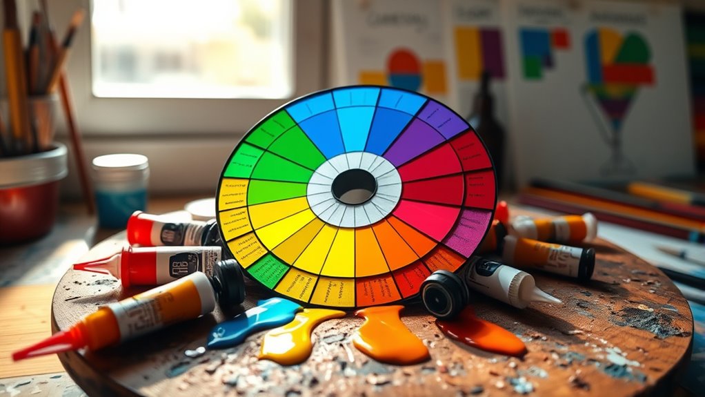
Have you ever wondered why certain color combinations instantly catch your eye or evoke specific emotions? It all comes down to an understanding of color harmony and the psychological impact of colors. When you choose colors intentionally, you can influence how others perceive your design, project, or space. Color harmony refers to the pleasing arrangement of colors that work well together, creating balance and visual appeal. It’s about understanding relationships on the color wheel—complementary, analogous, triadic—and using them to craft palettes that feel cohesive and intentional. Recognizing these relationships helps you create designs that draw attention without overwhelming, guiding viewers’ eyes smoothly across your work. Understanding color relationships enhances your ability to develop effective palettes that resonate emotionally and visually. But color harmony isn’t just about aesthetics; it’s deeply connected to the psychological impact of colors. Different hues can evoke specific emotions and reactions, influencing how your message is received. For instance, warm colors like red, orange, and yellow tend to energize and stimulate, often associated with excitement, warmth, or urgency. Cool colors like blue and green evoke calmness, trust, and serenity, making them ideal for spaces or brands that want to convey stability or relaxation. Understanding these psychological effects allows you to select colors that support your goals, whether you aim to inspire action, foster trust, or evoke nostalgia. When you combine knowledge of color harmony with an awareness of psychological impact, your palette choices become more powerful. For example, if you want to create a sense of excitement and urgency, you might choose a complementary scheme with vibrant reds and greens. Conversely, for a calming, professional look, an analogous palette of blues and greens can reinforce a sense of stability. By intentionally matching colors that elicit the right emotional responses, you can craft visuals that resonate more deeply with your audience. This strategic approach also helps you avoid jarring or confusing combinations, ensuring your message remains clear and compelling. Ultimately, mastering color theory means understanding how different colors interact and influence viewers on a subconscious level. It’s about more than just making things look pretty—it’s about harnessing the psychological impact of colors to communicate effectively. When you leverage color harmony wisely, you create visual experiences that are not only attractive but also meaningful and persuasive. Whether designing a logo, decorating a room, or creating artwork, your ability to select the right hues—guided by these principles—can elevate your work and forge a stronger connection with your audience.

Magic Palette Color Mixing Guide 11.5 Inch
Please__contact us to solve the problem w/ name: The Color Wheel 5324CW Magic Palette Personal Mixing Guide New…
As an affiliate, we earn on qualifying purchases.
As an affiliate, we earn on qualifying purchases.
Frequently Asked Questions
How Does Cultural Context Influence Color Perception?
Cultural context considerably influences your perception of color through cultural symbolism and regional color associations. You might associate white with purity in one culture, while in another, it symbolizes mourning. Regional color associations shape your emotional responses and choices, affecting how you interpret and use colors. Understanding these cultural nuances helps you make more meaningful, resonant palette choices, ensuring your work communicates effectively across different cultural audiences.
Can Color Theory Improve Branding Consistency?
Yes, color theory can definitely enhance your branding consistency. By understanding color symbolism, you can select hues that evoke the right emotions and messages. Using principles of color harmony ensures your palette is visually appealing and cohesive across all platforms. This alignment helps reinforce your brand identity, making it more memorable. When you apply these concepts, your branding feels unified, professional, and emotionally resonant with your audience.
What Are the Psychological Effects of Specific Color Combinations?
You might notice that different color combinations evoke specific emotional impacts through their color symbolism. For example, red and yellow can create excitement and energy, while blue and green promote calmness and trust. By understanding these psychological effects, you can choose palettes that resonate with your audience’s feelings, strengthening your brand message. Carefully selecting colors based on their emotional impact helps you communicate more effectively and foster deeper connections.
How Do Color Preferences Vary Across Different Age Groups?
Like a wise old sage, you notice that age-related preferences and generational color trends shape what people find appealing. Younger folks often prefer vibrant, energetic hues, while older generations lean toward muted, classic shades. These preferences evolve with cultural influences and life experiences. Understanding these trends helps you choose palettes that resonate, ensuring your designs connect across diverse age groups and evoke the right emotional response.
Are There Universal Color Rules Applicable to All Design Styles?
You should know that universal color rules don’t exist because each design style varies. However, focusing on color harmony helps create balanced compositions, while understanding color symbolism adds emotional depth. When choosing palettes, consider these principles to guarantee your color choices resonate universally and fit your style. Trust your instincts, but stay aware of how different colors evoke different feelings, making your design both effective and appealing.

JimKing Creative Color Wheel, Paint Mixing Learning Guide, Art Class Teaching Tool for Makeup Painting Tattoo,Blending Board Chart Color Mixed Guide Hardboard(9.25inch)
Helps organise colours to make choices and combinations easier;Defines common terms and helps the artist to understand colour…
As an affiliate, we earn on qualifying purchases.
As an affiliate, we earn on qualifying purchases.
Conclusion
Now that you understand the science behind color choices, you can craft palettes that evoke emotions and tell stories. Think of color theory as a bridge—connecting your ideas to viewers’ feelings—much like a painter blending shades to create depth. With this knowledge, you’ll transform simple hues into powerful visual statements. So, embrace the science, experiment boldly, and watch your designs come alive with vibrant purpose and harmony.

The Secret Language of Color Cards (Essential Wellness Series)
As an affiliate, we earn on qualifying purchases.
As an affiliate, we earn on qualifying purchases.

Mcbazel 3 Pieces Artist Color Mixing Guides Wheel, Paint Mixing Learning Art Teaching Tool & Theory Chart for Painting, Makeup, Tattoo Design – Large & Pocket Sizes for Studio & Class (3 Sizes)
Master Color Theory Visually – This dual-sided artist color wheel makes understanding color theory effortless. The front is…
As an affiliate, we earn on qualifying purchases.
As an affiliate, we earn on qualifying purchases.