
To create visual depth with color layers, start by using contrasting warm and cool hues to make elements stand out or recede. Layering translucent colors and blending softly can simulate natural lighting and shadows, while high contrast enhances dimensionality. Incorporate perspective by applying overlay layers that mimic atmospheric distance. Mastering these techniques transforms flat surfaces into vibrant, three-dimensional images. Keep exploring, and you’ll discover how to make your artwork leap off the page with depth and movement.
Key Takeaways
- Use layered hues to build smooth or bold transitions, mimicking natural light and enhancing realism.
- Apply hue contrast, pairing warm and cool colors to make elements appear closer or farther away.
- Incorporate semi-transparent overlay layers to create atmospheric perspective and depth.
- Blend colors thoughtfully to guide viewer focus and emphasize spatial relationships.
- Understand color perception to select palettes that intentionally create visual dimension.

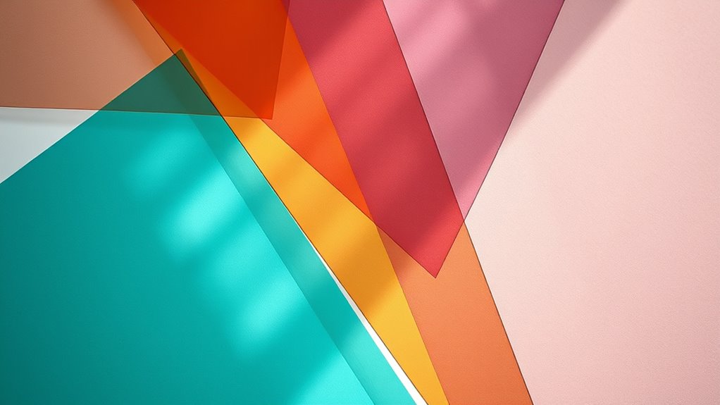
Adding layers of color can instantly transform a flat image into one with striking depth. When you understand how to use color blending and hue contrast effectively, your artwork gains a sense of dimension that draws viewers in. Instead of relying solely on shading or shadows, you can manipulate colors directly to create the illusion of depth. This technique allows you to make certain parts of your composition pop forward while others recede, giving your piece a lively, three-dimensional feel.
Start by considering how color blending works in your work. When you layer different hues, the progression between colors can feel smooth and natural or bold and dramatic, depending on your intent. By blending colors thoughtfully, you create subtle gradations that mimic how light interacts with surfaces, adding realism and depth. For example, blending a soft blue into a darker navy can suggest a shadowed area, while blending warm yellows into oranges can evoke sunlight hitting a surface. These layered colors help guide the eye across your composition, emphasizing the spatial relationships between objects.
Thoughtful color blending creates subtle transitions that enhance realism and guide viewers through your artwork.
Hue contrast is another powerful tool for creating depth. Think of it as a way to make certain elements stand out by contrasting their colors against others. When you place a bright, warm hue next to a cooler, muted color, the warmer tone appears to come forward, while the cooler recedes. This contrast tricks your eye into perceiving a layered space, where some elements push forward and others fall back. To maximize this effect, choose contrasting hues deliberately—such as reds against greens or yellows against purples—and vary the saturation and brightness levels. This deliberate manipulation of hue contrast adds vibrancy and dimensionality, making your composition more engaging.
You can also experiment by overlaying semi-transparent layers of contrasting colors, which enhances the depth effect. For instance, a translucent layer of teal over a sandy beige background can create a sense of atmospheric perspective, making distant objects seem farther away. Combining this with strategic hue contrast makes the layered colors feel more dynamic and realistic. Remember, it’s not just about applying color, but about how you blend and contrast those colors to mimic the natural play of light and shadow.
Furthermore, understanding how color perception influences visual depth enables you to choose palettes that support your artistic intentions more effectively. Ultimately, creating visual depth with color layers is about understanding how your choices influence perception. By skillfully blending hues and leveraging hue contrast, you turn flat, two-dimensional surfaces into immersive visual experiences. This technique invites viewers to explore your artwork more closely, enjoying the subtle nuances that give your images their three-dimensional quality. With practice, you’ll develop an intuitive sense for layering colors that enhances the depth and vibrancy of your creations, making them truly stand out.
Top picks for "creat visual depth"
Open Amazon search results for this keyword.
As an affiliate, we earn on qualifying purchases.
Frequently Asked Questions
How Do Lighting Conditions Affect Color Layering Techniques?
Lighting conditions considerably impact your color layering techniques. When light intensity is high, colors appear brighter and more vivid, making shadows less pronounced and reducing shadow contrast. In low light, colors soften, and shadows deepen, enhancing shadow contrast and creating a sense of depth. To achieve the desired effect, adjust your layers based on the lighting, emphasizing contrasts in shadows or bright highlights to enhance visual depth.
Can Color Layering Be Used Effectively in Digital Art?
You can definitely use color layering effectively in digital art. By applying layering techniques, you create smooth passages and vibrant color blending, adding depth and richness to your work. Digital tools make it easy to experiment with different opacities and blending modes, allowing you to refine your color layers until you achieve the desired effect. This approach enhances the overall visual impact, making your artwork more dynamic and engaging.
What Are Common Mistakes to Avoid When Creating Depth With Color?
Imagine building a layered cake, each layer adding richness. When you overuse contrasting hues or neglect color harmony, your artwork can feel chaotic, like a cake with mismatched flavors. Common mistakes include overusing contrasting hues, which can distract, and neglecting color harmony, making your piece look unbalanced. To create depth, blend colors subtly and maintain harmony, avoiding these pitfalls to achieve a cohesive, immersive visual experience.
How Does Color Theory Influence Layering for Depth?
Color theory directly influences how you layer colors for depth by guiding your choices in color harmony and emotional impact. When you select harmonious colors, your layers blend smoothly, creating a sense of depth. Using contrasting or emotionally resonant colors can make certain layers pop, adding dimension. By understanding color relationships, you can manipulate visual depth effectively, making your artwork more engaging and emotionally compelling for viewers.
Are There Specific Tools Recommended for Color Layering in Traditional Media?
You should explore tools like blending stumps, brushes, and palette knives for color blending in traditional media. These tools help you achieve smooth gradations and effective layering techniques, which are essential for creating depth. Use transparent glazes and build up layers gradually to enhance richness. By mastering these tools, you can control how colors interact and develop a sense of depth through thoughtful layering and transition.
Conclusion
By layering colors thoughtfully, you can transform flat designs into immersive experiences. Imagine a small business logo where deep blues and vibrant accents create a sense of trust and energy, drawing customers in emotionally. When you apply these techniques, you evoke feelings and guide viewers’ perceptions effortlessly. So, next time you design, think about how color layers can add that extra depth—making your work not just seen, but felt.