
To create cohesive color palettes in mixed media, start by drawing inspiration from nature, photos, or other artworks to identify key colors that set the mood. Choose a small set of core colors that resonate with your theme and test them on scrap materials to guarantee harmony. Use color harmony principles like complementary or analogous schemes and limit your choices to strengthen unity. Paying attention to how different media interact and layering techniques will also boost harmony—continue exploring for more tips.

Get art and craft supplies delivered free — and shop member deals
- Fast, free delivery on millions of items
- Access to Prime Big Deal Days deals on October 6–7
- Prime Video, Amazon Music and more included
Key Takeaways
- Draw inspiration from nature, photos, or artworks to establish a foundational color palette aligned with your theme.
- Choose a small set of core colors using harmony principles like complementary, analogous, or triadic schemes for balance.
- Test colors on scrap materials or small sections to ensure cohesive interaction across different media before full application.
- Limit your color choices and use accents or highlights strategically to maintain visual harmony and focus.
- Allow your color palette to evolve during the creative process, adjusting as layered media influence overall cohesion.
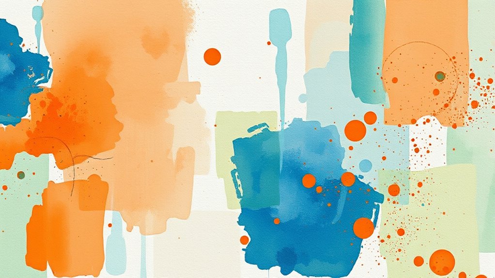
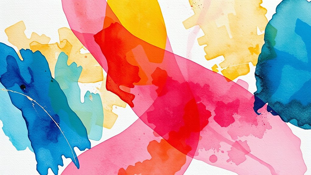
Creating a cohesive color palette in mixed media can considerably enhance the unity and visual impact of your artwork. When you focus on color harmony, you ensure that all the different elements work seamlessly together, guiding the viewer’s eye and evoking the mood you intend. To do this effectively, you need to draw inspiration from various sources—nature, photographs, other artworks—and let these serve as your palette inspiration. By gathering a few key colors early on, you can create a foundation that ties your diverse media together.
A cohesive palette unites diverse media, guiding the eye and enhancing your artwork’s mood and impact.
Start by selecting a core color or a small set of colors that resonate with the emotion or theme you want to convey. These serve as your anchor points, giving your piece a sense of purpose. When choosing your palette inspiration, consider the overall feeling you want—calm and soothing, vibrant and energetic, or perhaps somber and reflective. Once you’ve identified the mood, look for color combinations that support it. For example, if you’re aiming for tranquility, soft blues and gentle greens can set the tone; for energy, bright reds and yellows might be more appropriate. Use color harmony principles, such as complementary, analogous, or triadic schemes, to ensure your palette feels balanced and pleasing to the eye.
In mixed media, where textures and materials vary, maintaining a cohesive palette becomes even more critical. Different media can sometimes create visual dissonance if the colors clash or seem out of place. To prevent this, keep your palette consistent across all media—whether you’re working with watercolor, acrylics, collage elements, or ink. Mix your colors carefully, testing them on scrap paper or small sections before applying them to your main piece. This step helps you see how colors interact and ensures your palette remains harmonious throughout.
Additionally, consider limiting your color choices to avoid overwhelming the composition. Fewer colors can make your artwork feel more unified and intentional. When you do add accents or highlights, choose colors that complement or contrast thoughtfully, reinforcing the overall harmony. Remember, your palette inspiration doesn’t have to be static; it can evolve as you work, guided by how the colors interact in your layered media. By consciously paying attention to color harmony and drawing inspiration from various sources, you’ll craft a cohesive palette that unifies your mixed media artwork and elevates its visual storytelling.
As an affiliate, we earn on qualifying purchases.
Frequently Asked Questions
How Do I Choose a Dominant Color for My Palette?
When choosing a dominant color, think about establishing a clear visual hierarchy. Your dominant color should draw attention and set the tone, so pick a hue that complements your overall mood. Consider the color’s impact and how it interacts with secondary colors. Use it consistently across your mixed media pieces to create harmony, ensuring it guides the viewer’s eye and ties your palette together seamlessly.
What Tools Can Help Visualize Color Harmony?
To visualize color harmony, you can use a color wheel, which shows complementary, analogous, and triadic schemes, helping you see how colors work together. Digital apps like Adobe Color or Coolors are also great tools; they let you experiment with different palettes instantly and see how colors interact. These tools make it easier to plan harmonious color combinations, ensuring your mixed media work feels cohesive and visually appealing.
How Can I Fix Color Mismatches in Mixed Media?
Ah, the eternal struggle of matching colors—because who doesn’t love a good challenge? When fixing mismatches, consider shifting your palette to complementary schemes or balancing warm versus cool tones. Add a touch of neutral or layer with transparent glazes to unify disparate hues. You’re basically the conductor of a symphony, ensuring each color harmonizes rather than clashes, transforming chaos into cohesive beauty.
What Are Common Mistakes When Creating Color Palettes?
When creating color palettes, you often make mistakes like ignoring color theory or disrupting palette balance. You might choose colors that clash or don’t harmonize, making your artwork look chaotic. To avoid this, consider color relationships and use a balanced mix of warm and cool tones. Keep your palette cohesive by testing colors together beforehand. Being mindful of color theory and maintaining palette balance helps create a visually appealing, unified piece.
How Do Lighting Conditions Affect Color Perception?
Lighting conditions are the stage where your colors perform, and they can alter your scene entirely. You might think colors look perfect under daylight, but in warm ambient lighting, they’ll shift, like a chameleon in a new environment. Color temperature and ambient lighting influence how you perceive hues, making your artwork appear warmer or cooler than intended. Always check your colors in different lighting to verify they stay true to your vision.
As an affiliate, we earn on qualifying purchases.
Conclusion
Think of your color palette as a garden, each hue a unique flower. When they bloom together harmoniously, they create a vibrant, balanced landscape that draws viewers in. By choosing colors thoughtfully, you’re planting seeds of unity and contrast that grow into a stunning visual story. Remember, your palette is the heartbeat of your artwork—nurture it carefully, and watch your mixed media masterpiece flourish with life and meaning.
artistic color palette organizer
As an affiliate, we earn on qualifying purchases.
As an affiliate, we earn on qualifying purchases.
watercolor and acrylic paint set
As an affiliate, we earn on qualifying purchases.
As an affiliate, we earn on qualifying purchases.
Fall Picks
fall essentials
As an affiliate, we earn on qualifying purchases.