To interpret color trends for your art, pay attention to cultural shifts and societal moods reflected in fashion, design, and media. Use color psychology to choose hues that evoke specific emotions, like warmth or calmness, and consider cultural meanings to guarantee your messages are clear and respectful. Experiment with new combinations that align with current themes, creating emotionally resonant pieces. Keep exploring ongoing trends, and you’ll discover fresh ways to make your art more relevant and impactful.
Key Takeaways
- Analyze current fashion, interior, and digital media to identify dominant colors and palettes reflecting societal moods.
- Use color psychology to understand emotional responses associated with trending hues for deeper artistic impact.
- Consider cultural meanings and nuances of colors to ensure your art communicates appropriately and resonates globally.
- Blend trending colors with personal style, experimenting with combinations and tonal shifts to create fresh, relevant artwork.
- Stay adaptable by monitoring ongoing societal shifts and incorporating emerging color trends for culturally sensitive expression.
Understanding color trends is essential for staying ahead in design and fashion, as they reflect cultural shifts and societal moods. When you interpret these trends, you’re tapping into a complex interplay of color psychology and cultural influences that shape how people perceive and respond to color. Color psychology helps you understand the emotional impact of different hues; for example, warm colors like red and orange evoke energy and passion, while cool tones like blue and green promote calmness and stability. Recognizing these associations allows you to create art that resonates on a deeper emotional level, aligning your work with current societal sentiments and individual feelings.
Understanding color trends helps create emotionally resonant art aligned with societal moods and cultural insights.
Cultural influences play a significant role in dictating which colors are trending at any given time. Colors can carry specific meanings or associations rooted in traditions, history, or recent events within a society. For instance, white symbolizes purity in Western cultures but is associated with mourning in some Eastern societies. As a creator, you need to stay attuned to these cultural nuances to ensure your color choices communicate the right message or evoke the desired response. This awareness helps you avoid misinterpretation and enables you to craft artwork that is culturally sensitive and relevant.
To interpret color trends effectively, you should observe the broader cultural landscape—what’s dominating fashion runways, interior design, or digital media. These sectors often serve as barometers for societal moods, highlighting growing preferences for certain colors or palettes. By analyzing these trends, you can incorporate colors that are not only fashionable but also meaningful within the context of current cultural narratives. For example, a surge in earthy tones might reflect a collective desire for sustainability and connection to nature, guiding you to use these hues in your art to mirror those values.
Furthermore, understanding the relationship between color psychology and cultural influences enables you to innovate while remaining relevant. You might experiment with unexpected combinations or subtle shifts in tone that align with emerging trends, creating art that feels both fresh and culturally aware. Staying flexible and receptive to ongoing shifts in societal moods ensures your work remains impactful and contemporary.
Additionally, studying anime movies and animated films that touch hearts can inspire new approaches to color and emotional storytelling, allowing you to incorporate these insights into your art. In essence, interpreting color trends involves a keen awareness of how cultural influences and psychological associations guide societal preferences. By observing these factors, you can make intentional color choices that communicate effectively, evoke emotion, and resonate with your audience. This approach not only enhances your artistic expression but also positions you as a perceptive creator who understands the pulse of current cultural shifts.

The Secret Lives of Color
As an affiliate, we earn on qualifying purchases.
As an affiliate, we earn on qualifying purchases.
Frequently Asked Questions
How Do Cultural Differences Influence Color Trend Interpretations?
Cultural differences heavily influence how you interpret color trends, as cultural symbolism varies across regions. For example, red might symbolize luck in China but danger in Western countries. You should consider regional palettes when analyzing trends, as colors resonate differently depending on local traditions and beliefs. By understanding these cultural nuances, you can better tailor your art to connect meaningfully with diverse audiences, respecting their unique symbolism and preferences.
Can Personal Experiences Override Current Color Trend Influences?
Did you know that 65% of artists rely on personal intuition over trend influences? When it comes to color choices, your personal experiences and emotional expression can definitely override current trends. You have the power to create authentic art that resonates deeply, regardless of what’s fashionable. Trust your feelings and memories—they shape your unique style and help you communicate more effectively through your colors.
What Tools Are Best for Predicting Future Color Trends?
You should focus on tools that excel in color forecasting and trend analysis. Use platforms like Pantone’s Color of the Year predictions, WGSN, or Adobe Color Trends, which analyze industry data and consumer behavior. These tools help you anticipate future palettes, giving you a competitive edge. Combining these insights with your personal style allows you to stay ahead of trends while maintaining unique artistic expression.
How Do Seasonal Changes Affect Color Trend Relevance?
Think of the seasons as the artist’s palette—each offering a unique seasonal palette that influences color trends. You’ll notice weather influence plays a big role, shifting hues from warm, cozy tones in winter to bright, lively shades in summer. As seasons change, so does the relevance of certain colors, guiding your choices to align with nature’s rhythm. Embrace this cycle, and your art will resonate with timely, authentic appeal.
Are There Any Risks in Strictly Following Color Trends for Art?
You risk limiting your artistic originality by strictly following color trends, as it can lead to trend dependency. Relying solely on current trends might make your work seem less unique or timeless, potentially stifling your creative voice. While trends can inspire, it’s important to balance them with your personal style to guarantee your art remains authentic and innovative, rather than just a reflection of fleeting color fads.

gisgfim 21Pcs Spanish Speaking Countries Culture Posters Multicultural and Diversity Classroom Decorations Study Materials for Teachers Middle School High School Social Study Classroom Decor
What you get: You will get 21 pieces exquisitely designed posters featuring the national flag, national representative animal,…
As an affiliate, we earn on qualifying purchases.
As an affiliate, we earn on qualifying purchases.
Conclusion
Remember, colors speak louder than words, so trust your instincts and stay curious. By understanding current trends, you can create art that resonates and feels fresh. Don’t be afraid to experiment and put your unique spin on popular palettes. As the saying goes, “Variety is the spice of life,” so embrace different colors and ideas. Keep exploring, and let your creativity shine through every hue you choose.

Color Analysis Draping Kit – Find Your Season at Home | DIY Color Analysis | 36 Face Frames + Step-by-Step Guide | 12-Season System | Chromawings
FIND YOUR SEASON AT HOME: See instantly which colors make your skin look brighter and more even. With…
As an affiliate, we earn on qualifying purchases.
As an affiliate, we earn on qualifying purchases.
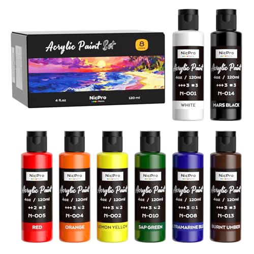
Nicpro 8 Primary Colors Acrylic Paint Set(4 oz, 120 ml), Rich Pigment, Non Toxic Craft Paint for Multi Surface Canvas, Wood, Ceramic, Rock, Fabric, Art Painting Supplies for Beginner & Artist Adult
8 PRIMARY COLORS ACRYLIC PAINT SET – This acrylic paint set contains 8 vibrant primary colors: White, Mars…
As an affiliate, we earn on qualifying purchases.
As an affiliate, we earn on qualifying purchases.