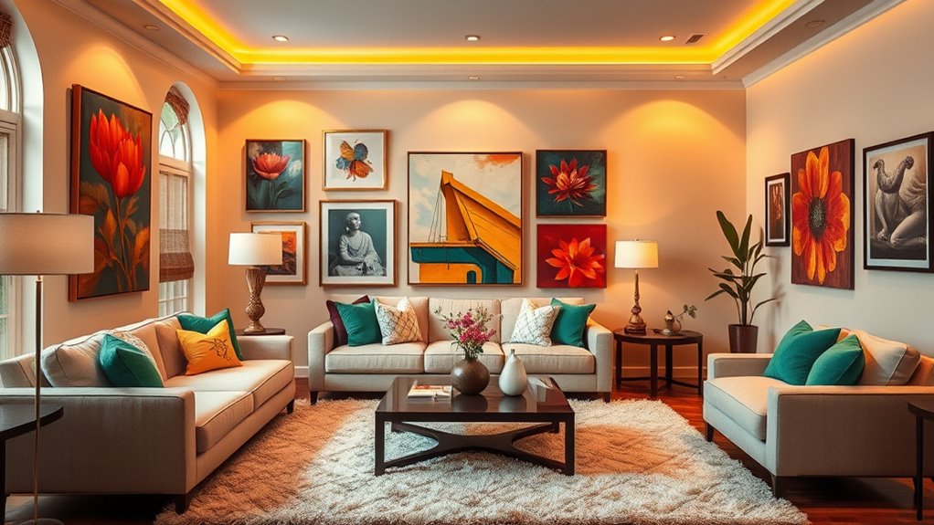

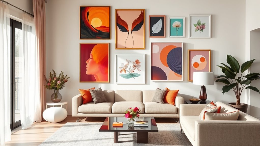
Using colour theory when displaying art at home helps you create balanced, vibrant, and inviting spaces. By understanding colour wheel basics and schemes like complementary or monochromatic, you can choose artworks that harmonize with your room’s palette. Consider warm or cool tones, contrast, and the placement of pieces to guide the eye naturally. Balancing bright and neutral shades enhances visual interest. Keep exploring how these principles can transform your decor with confidence and style.
Key Takeaways
- Use complementary colours opposite on the wheel to create vibrant contrast and focal points in your art display.
- Select wall and room colours that harmonize or subtly contrast with your artwork to enhance visual cohesion.
- Balance bold art with neutral backgrounds and accents to prevent overwhelming the space and maintain harmony.
- Arrange artworks with gradual colour transitions or analogous hues for a smooth visual flow.
- Consider colour temperature and lighting to highlight art’s hues and evoke the desired mood in your space.
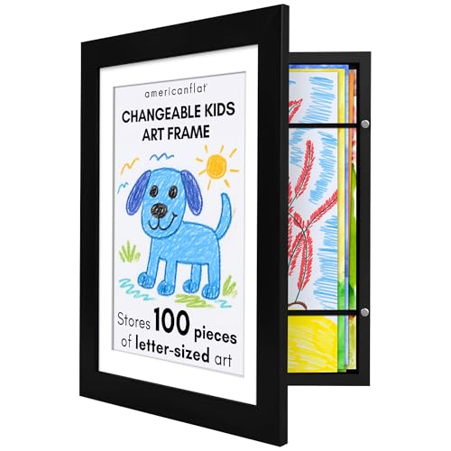
Americanflat Kids Artwork Frame Changeable (Black) – Magnetic Door Holds 100 Art Pieces – 8.5×11 Letter Size Display with Mat or 10×12.5 Without Mat – My Mini Masterpiece
Turn every drawing, doodle, and masterpiece into a gallery-worthy showcase with our frames for kids' artwork. Matted for…
As an affiliate, we earn on qualifying purchases.
As an affiliate, we earn on qualifying purchases.
Understanding the Basics of Colour Theory
Understanding the basics of colour theory is essential for effectively displaying art at home. The colour wheel is your key tool, helping you visualize how colours relate to each other. It’s divided into primary, secondary, and tertiary colours. Primary colours—red, blue, and yellow—are the foundation because they can’t be created by mixing other colours. You use the colour wheel to identify complementary colours, which sit opposite each other, creating vibrant contrasts when paired. Knowing these basics helps you choose artworks that balance or energize a space. When you understand how colours interact, you can craft a cohesive look, highlight specific pieces, or create visual harmony. Mastering the colour wheel and primary colours gives you the confidence to display art that complements your home’s style. Incorporating an understanding of colour harmony can further enhance your ability to create visually appealing arrangements.

The Color Wheel Company Interior Design Wheel interior design color wheel, Multi
Perfect for selecting color combinations for interior decorating
As an affiliate, we earn on qualifying purchases.
As an affiliate, we earn on qualifying purchases.
Exploring Colour Harmonies and Schemes
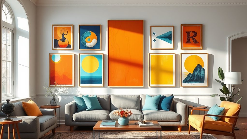
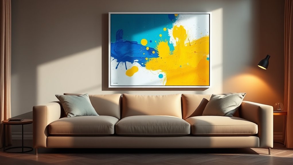
Building on your knowledge of the colour wheel, exploring colour harmonies and schemes allows you to create visually appealing and balanced arrangements in your home. Complementary contrast involves pairing colours opposite each other on the wheel, like blue and orange, to produce vibrant, eye-catching displays. This scheme energizes a space but works best with moderation to avoid overstimulation. Monochromatic schemes use various shades, tints, and tones of a single colour, resulting in a harmonious and cohesive look. They add depth without overwhelming the senses, making them perfect for subtle, sophisticated art displays. Additionally, understanding colour psychology can help you select art and accessories that evoke specific moods or feelings, enhancing your space’s overall harmony. By understanding these schemes, you can intentionally select art and accessories that enhance your space’s overall harmony, ensuring your home feels both lively and unified.

ALL-IN-ONE Paint by Heirloom Traditions, Tapestry (Khaki Brown), Quart – Durable cabinet and furniture paint. Built in primer and top coat, no sanding needed. Includes our 30 featured color card.
Includes 30 featured and newest released color card. Sprayed on color to see our colors in your homes…
As an affiliate, we earn on qualifying purchases.
As an affiliate, we earn on qualifying purchases.
Choosing the Right Background and Wall Colours

Selecting the right background and wall colours is essential because these choices set the tone for your art displays and influence the overall mood of your space. Lighting effects play a a vital role; warm lighting can enhance soft wall colours, while cool lighting highlights bold hues. Consider wall textures as well—smooth finishes provide a sleek backdrop, whereas textured walls add depth and interest that can complement your artwork. Neutral tones like beige or soft grey work well as versatile backgrounds, allowing your art to stand out. If you want to create a calming atmosphere, opt for cool colours like blues or greens. For vibrancy, warm colours such as terracotta or mustard are effective. Always test colours in your space, observing how lighting and textures interact before making your final decision. Incorporating colour theory principles can further refine your choices to achieve the desired aesthetic and emotional impact.

EZVALO Picture Light for Wall, 4800mAh Rechargeable Wireless Remote, 16in Dimmable Magnetic LED Art Display Light with 3 Color Temperatures, for Gallery, Living Room, Bedroom, Hallway (Gold)
Powerful 4800mAh Rechargeable Battery: Say goodbye to battery swaps and messy cords! Built-in 4800mAh battery offers 11 hours…
As an affiliate, we earn on qualifying purchases.
As an affiliate, we earn on qualifying purchases.
Coordinating Art Pieces With Room Palette
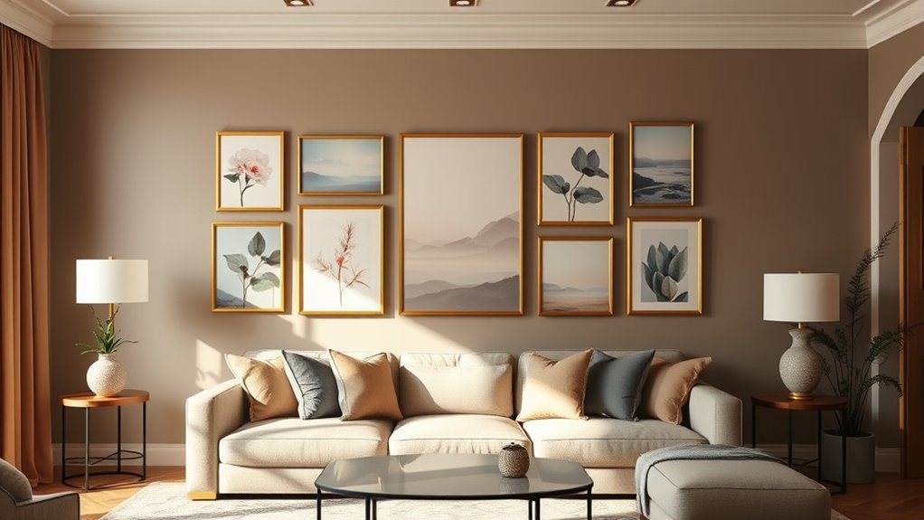
To create a harmonious display, you need to coordinate your art pieces with your room’s overall color palette. First, consider frame styles: choose frames that complement your room’s aesthetic—sleek and modern or ornate and traditional. Second, pay attention to lighting considerations; natural light highlights colors, while warm or cool lighting can alter their perception. Third, guarantee your art’s dominant hues align with or subtly contrast your room’s palette to unify the space. Incorporate artworks with colors that echo the room’s tones or introduce a complementary accent for visual interest. Proper coordination creates cohesion and balance, making your art feel intentional. Additionally, understanding the seasonal variations can help you select artwork that resonates with the changing ambiance throughout the year. By thoughtfully selecting frame styles and considering lighting, you enhance your art’s impact within your room’s overall color harmony.
Using Contrasting Colours to Create Visual Interest
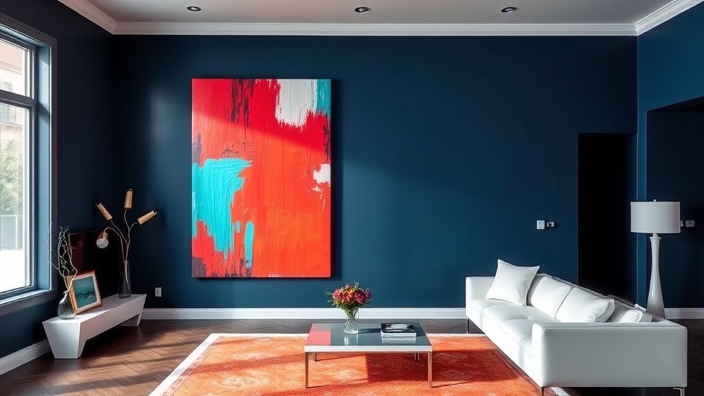
Contrasting colours can instantly draw attention and add energy to your art display. Using complementary contrasts, such as blue and orange or red and green, creates vibrant pairings that stand out and make a bold statement. These contrasting hues emphasize each other, making your artwork pop against the background or surrounding decor. You can place pieces with high contrast near each other to generate visual interest or use them as accents to highlight specific areas. Remember, the key is balance—too many strong contrasts can feel chaotic, so pair them thoughtfully with neutral tones. By intentionally selecting complementary contrasts, you enhance the dynamic quality of your art display and keep viewers engaged. This approach helps your art become a mesmerizing focal point in your home.
Applying Colour Temperature for Mood Enhancement
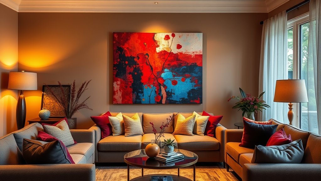
Choosing warm tones like reds and oranges can make your space feel cozy and inviting, perfect for relaxing areas. Conversely, cool shades such as blues and greens promote calmness and serenity in your rooms. By applying these colour temperatures thoughtfully, you can enhance the mood and atmosphere of your home. Additionally, understanding high-quality paint application techniques, such as using an airless sprayer, can ensure smooth, even coverage that truly brings out your chosen colour palette.
Warm Tones for Cozy Spaces
Warm tones instantly create inviting and intimate atmospheres in your home, making spaces feel more cozy and comfortable. By understanding colour psychology, you can select hues that evoke feelings of warmth and security, enhancing your environment’s mood. To maximize their impact, consider these artistic techniques:
- Use rich, earthy shades like terracotta or amber to foster a sense of comfort.
- Incorporate layered textures and warm lighting to deepen the warm tone effect.
- Display art with warm colour schemes to reinforce the cozy ambiance.
- Remember that ethical hacking practices, like secure system design, can inspire thoughtful choices in creating a safe and inviting space.
These strategies help you craft spaces that feel welcoming and personal. Applying colour temperature thoughtfully not only influences mood but also elevates your aesthetic, creating harmonious environments that invite relaxation and connection.
Cool Shades for Calmness
When you incorporate cool shades into your home, you actively promote a sense of calm and tranquility. Cool shades, like blues, greens, and soft lavenders, help create a calming ambiance that soothes the mind and reduces stress. These hues work well in spaces meant for relaxation, such as bedrooms or living rooms. Using artwork with cool shades enhances the peaceful atmosphere, encouraging rest and mental clarity. Additionally, cool shades tend to recede visually, making rooms feel more spacious and open. Incorporating color accuracy into your art display can further ensure that the hues remain true and impactful. By thoughtfully selecting art with calming hues, you set a serene tone that promotes comfort and emotional balance. Incorporating cool shades is an effective way to harness colour temperature for mood enhancement, transforming your space into a peaceful retreat.
Balancing Bright and Neutral Tones in Art Displays
Balancing bright and neutral tones in your art displays can create a harmonious and inviting space. To achieve this, focus on the following strategies:
- Use complementary accents—such as vibrant cushions or décor—to highlight bright artwork without overwhelming neutral backgrounds.
- Apply tonal layering by pairing artwork with varying shades of neutral tones, adding depth and interest.
- Incorporate subtle pops of color through accessories that tie bright pieces to neutral surroundings, ensuring a cohesive look.
This approach allows bright art to stand out while maintaining visual balance. By thoughtfully integrating complementary accents and tonal layering, you create a space that feels lively yet calm, highlighting your art’s vibrancy without sacrificing sophistication.
Tips for Grouping and Arranging Artwork by Colour

When you group artwork by color, you can create a cohesive look that feels intentional and balanced. Focus on harmonizing color schemes to enhance the overall mood and flow of the space. Arranging pieces with a clear visual flow helps your display feel natural and inviting. Incorporating color theory principles can further refine your arrangement for a more aesthetically pleasing result.
Harmonize Color Schemes
Grouping artwork by color creates a cohesive and visually appealing display that draws the eye and unifies your space. To achieve harmonious arrangements, consider these tips:
- Use analogous harmony by selecting artworks with similar hues, creating a smooth progression and a calming effect.
- Incorporate complementary contrast by pairing pieces with contrasting colors that enhance each other, adding vibrancy.
- Balance your display by mixing both approaches, ensuring no single color dominates while maintaining overall unity.
- Recognize the importance of visual balance when arranging pieces to prevent clutter and create a pleasing aesthetic.
Create Visual Flow
To create a seamless visual flow, start by arranging artworks so that colors shift smoothly from one piece to the next. Use color blocking to group similar hues, which helps the eye move effortlessly across your display. Incorporate monochromatic schemes by pairing artwork with varying shades of the same color, creating harmony and depth. When grouping pieces, consider the intensity and warmth of colors, ensuring progressions are gradual. Avoid abrupt contrasts that disrupt the flow. You might cluster artworks with complementary or analogous colors to enhance cohesion. By thoughtfully arranging your art based on color relationships, you guide viewers’ eyes naturally from one piece to another, creating a unified and visually appealing display that feels both intentional and balanced.
Frequently Asked Questions
How Can I Incorporate Bold Colours Without Overwhelming My Space?
To incorporate bold colours without overwhelming your space, start with a bold accent piece like a vibrant painting or cushion. Use colour balance by pairing these bold colours with neutral walls or furniture to create harmony. You can also limit the number of bold accents, allowing them to stand out without dominating the room. This approach keeps your space lively and balanced, making bold colours a stylish statement rather than an overwhelming force.
What Are the Best Colours for Small or Low-Light Rooms?
In small or low-light rooms, you should choose colours that brighten and expand the space. Light shades like soft blues, warm neutrals, or pastel tones work well, considering lighting considerations. Colour psychology suggests that these hues create a sense of openness and calm. Avoid dark colours, which can make the room feel smaller. Use reflective surfaces and strategic lighting to enhance brightness and complement your colour choices effectively.
How Do I Select Art That Complements Existing Decor?
To select art that complements your existing decor, focus on colour harmony and decor coordination. Look for pieces that either match your room’s dominant colours or create pleasing contrasts. Consider the style and mood of your decor—sleek, modern pieces work well with minimalist settings, while vibrant art suits eclectic spaces. Trust your instincts, but also use colour theory principles to guarantee your art enhances your home’s overall aesthetic effortlessly.
Can Colour Theory Help in Mixing Different Art Styles?
Color theory can definitely help you mix different art styles effectively. By applying complementary color schemes and color harmony principles, you create visual balance and cohesion. You’ll know which colors work well together, even if the art styles differ. This approach guarantees your display feels intentional and harmonious, guiding the eye smoothly across your collection. Ultimately, it helps you combine diverse pieces into a unified, pleasing aesthetic.
What Are Common Mistakes to Avoid When Using Colour in Art Displays?
When displaying art at home, you want to avoid common mistakes like colour clashing and using inappropriate palettes. You might think bold colours always work together, but they can clash if not chosen carefully. Stick to harmonious colour combinations, and consider the room’s lighting and existing decor. Don’t rely solely on intuition; understanding colour relationships helps you create a balanced, visually pleasing display that enhances your space.
Conclusion
By applying colour theory, you can transform your home into a vibrant, harmonious space. Did you know that rooms with well-coordinated colours can boost your mood and productivity by up to 25%? When you understand how to balance warm and cool tones, contrast, and colour schemes, your art displays become more engaging and inviting. So, experiment with different palettes and arrangements—you’ll create a personalized, enthralling environment that truly reflects your style.