In gallery spaces, color psychology plays a key role in shaping your emotional experience. Warm hues like reds and oranges energize you, adding excitement to the environment, while cool tones such as blues and greens promote calm and introspection. Lighting effects further influence how colors appear and the mood they evoke, guiding your focus and engagement. By understanding these principles, you’ll discover how carefully chosen colors and lighting deepen your connection with artworks and stories—keep exploring to learn more.
Key Takeaways
- Colors in galleries influence visitor emotions and perception, guiding engagement and mood through strategic choices.
- Warm hues energize and stimulate, while cool tones promote calmness and contemplation within the space.
- Lighting effects enhance color impact, creating atmospheres that evoke specific emotional responses.
- Color psychology helps craft environments aligned with desired visitor experiences, from excitement to serenity.
- Harmonious use of color and lighting deepens emotional resonance, fostering reflection and immersive engagement.
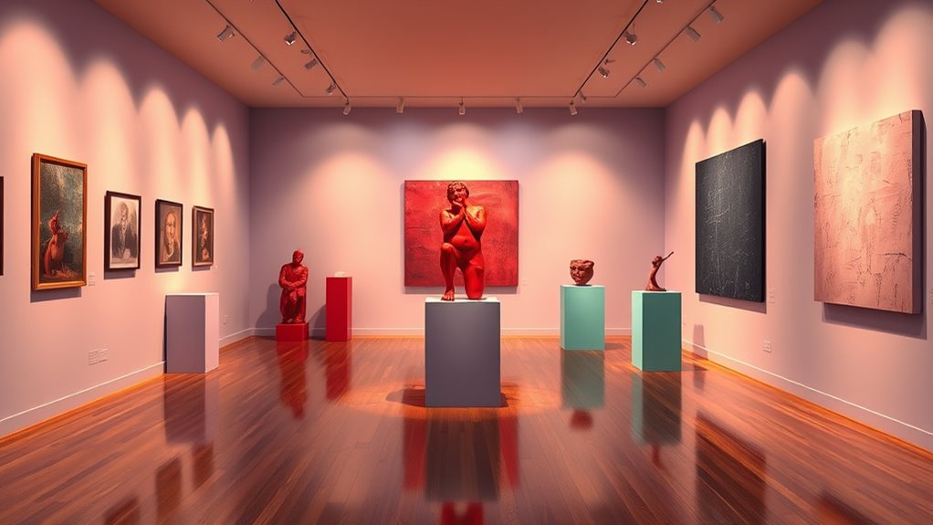
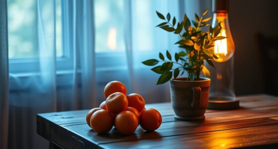
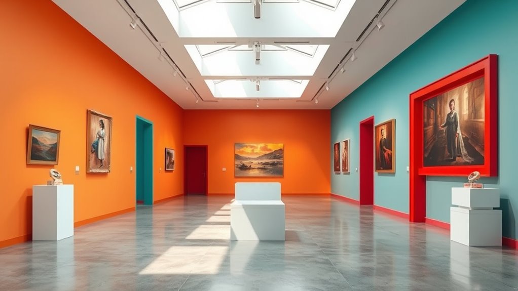
Color plays a crucial role in shaping how visitors experience gallery spaces, directly influencing their mood, focus, and emotional response. When you step into a gallery, the colors surrounding you aren’t just background elements—they’re active tools that guide your perception and engagement. One of the most powerful ways color impacts your experience is through lighting effects. Lighting can alter how colors appear, intensify certain hues, or create subtle shifts that change the atmosphere entirely. Bright, warm lighting makes reds and oranges pop, energizing the space and encouraging a lively, enthusiastic mood. Cooler, subdued lighting can soften blues and greens, fostering calmness and contemplation. By carefully designing lighting effects, curators can control the emotional tone of each exhibit, subtly steering your reactions and perceptions.
These lighting choices don’t just affect the artwork; they also influence your overall engagement with the space. When lighting highlights specific pieces or details, it draws your eye and invites closer inspection. Conversely, dim or diffuse lighting might create a sense of mystery or intimacy, encouraging you to linger and explore more deeply. As you move through different sections of a gallery, the interplay of lighting and color can create a dynamic experience, making each visit feel unique. This deliberate manipulation of lighting effects enhances viewer engagement by immersing you more fully in the artwork and the narrative the space aims to convey.
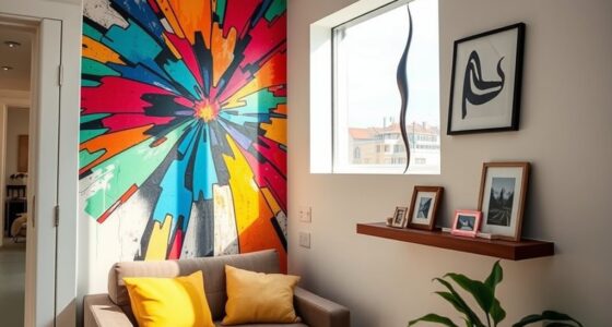
Color psychology in gallery spaces also considers how different hues evoke specific emotional responses. Warm tones like reds, yellows, and oranges tend to energize and stimulate, making them ideal for spaces meant to inspire excitement or passion. Cool tones such as blues, greens, and purples evoke calmness, serenity, and introspection, perfect for areas that encourage reflection. Neutral colors like grays and beiges act as quiet backgrounds that allow the artwork to take center stage without competing for attention. Additionally, understanding the influence of spiritual energy can deepen the emotional resonance of the space, as the colors and lighting work together to create a sense of harmony and balance. By blending these color choices with thoughtful lighting effects, curators can craft environments that align with the intended mood of each exhibit, influencing how you connect emotionally with the art.
Ultimately, the combination of lighting effects and color psychology in gallery spaces is about creating a cohesive experience that heightens your engagement and emotional connection. The thoughtful use of color can make artworks more impactful, deepen your understanding, and make your visit memorable. As you explore, you’ll notice how subtle shifts in lighting and hue influence your feelings, guiding your journey through each curated space. It’s this careful orchestration that transforms a simple gallery visit into a compelling and emotionally resonant experience.

Kryoza 4 Pack Brass Picture Lights for Wall Art, 5000mAh Cordless Gallery Lighting Battery Operated Rechargeable, 3 Color Temps with Remote Control Wall Light for Picture Frame Artworking Portrait
【3 Adjustable Color Temperatures &Customizable Brightness 】Switch between warm white (2700K), natural white (4500K), and cool white (6500K)…
As an affiliate, we earn on qualifying purchases.
As an affiliate, we earn on qualifying purchases.
Frequently Asked Questions
How Do Lighting Choices Interact With Wall Colors in Galleries?
You should consider how lighting contrast and wall color harmony work together in galleries. Strategic lighting highlights artwork by creating contrast with wall colors, making pieces stand out. At the same time, choosing complementary or harmonious wall colors guarantees a cohesive, inviting space. Properly balancing lighting and wall tones enhances visual appeal, guiding visitors’ attention and creating an immersive experience that showcases art effectively without overwhelming or underwhelming the viewer.
Can Color Psychology Influence Visitor Behavior and Engagement?
You might think colors are just aesthetic choices, but they actually sway visitor behavior more than you realize. Color psychology substantially influences the psychological impact and emotional response of your audience. Bright reds energize, calming blues soothe, and vibrant yellows inspire curiosity. By intentionally choosing colors, you guide visitors’ engagement, making your gallery not just a space for viewing art but an experience that emotionally resonates and leaves a lasting impression.
Are There Cultural Differences in Color Perception Within Galleries?
You might notice that cultural differences shape how people perceive colors, influenced by cultural color symbolism and regional color preferences. These variations affect visitor reactions, as certain hues evoke different emotions and meanings across cultures. When designing gallery spaces, you should consider these cultural nuances to guarantee your exhibits resonate universally, creating an engaging environment that respects diverse perceptions and enhances visitor experience through thoughtful color choices.
How Does Color Affect the Perceived Value of Artwork?
Think of color as the gallery’s spotlight, shaping how viewers value artwork. Higher color saturation and contrast effects can make a piece seem more vibrant and desirable, elevating its perceived worth. Conversely, muted tones might downplay its significance. You influence this perception directly through strategic color choices, guiding viewers’ emotional responses and enhancing the artwork’s value in their eyes. Your color decisions can turn a simple piece into a treasured masterpiece.
What Are the Best Colors for Minimizing Visitor Fatigue?
You should choose colors with low contrast, like soft neutrals or muted tones, to minimize visitor fatigue. These colors create a calming environment and reduce eye strain. Incorporating wall textures, such as matte finishes or subtle patterns, also helps diffuse light and prevent harsh glare. By balancing appropriate color contrast and textured walls, you make the space more comfortable, encouraging visitors to stay longer and enjoy the artwork without feeling overwhelmed.

KSIPZE 100ft Led Strip Lights RGB Music Sync Color Changing Led Lights with Smart App Control Remote Led Lights for Bedroom Room Lighting Flexible Home Décor
APP and IR Remote Contorl: With a stable connection,control your LED lights,freely change in 16 million colors,adjust brightness,customize…
As an affiliate, we earn on qualifying purchases.
As an affiliate, we earn on qualifying purchases.
Conclusion
You might think color choice in galleries is just about aesthetics, but it really influences how visitors feel and experience art. Some say warm tones evoke excitement, while cool shades promote calm reflection. Remarkably, studies suggest color psychology holds weight—though it’s not a one-size-fits-all rule. So, next time you walk through a gallery, notice how the colors make you feel; they’re more powerful than you might realize, shaping your entire viewing experience.

EZVALO Picture Light for Wall, 4800mAh Rechargeable Wireless Remote Battery Lights for Painting, 16In Dimmable Magnetic LED Art Display Light, Colors Temperatures, for Gallery, Living Room,Hallway
USB Rechargeable & Easy Charge: Our picture light with with built-in 4800mAh large-capacity battery and comes with a…
As an affiliate, we earn on qualifying purchases.
As an affiliate, we earn on qualifying purchases.

How to Decorate My Home: : A Comprehensive Guide
As an affiliate, we earn on qualifying purchases.
As an affiliate, we earn on qualifying purchases.